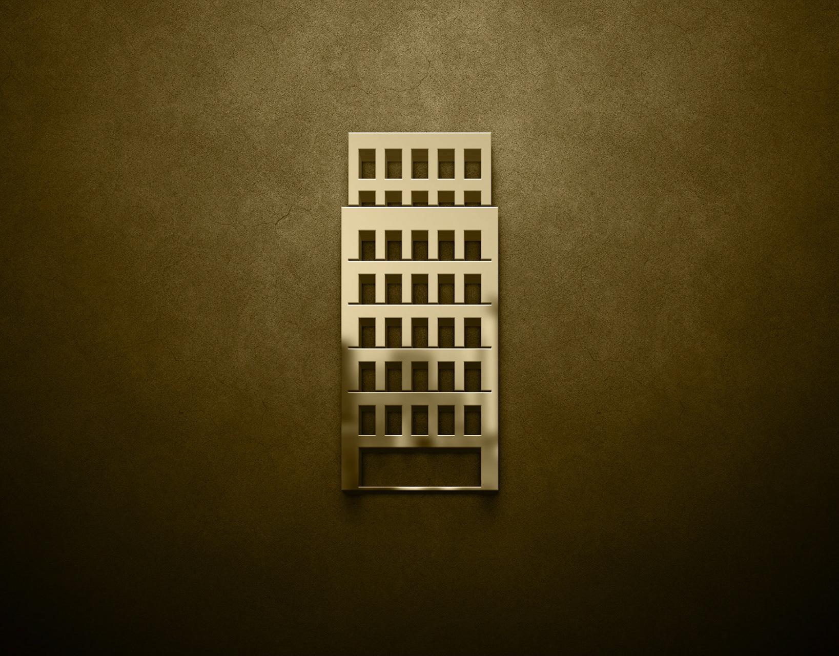
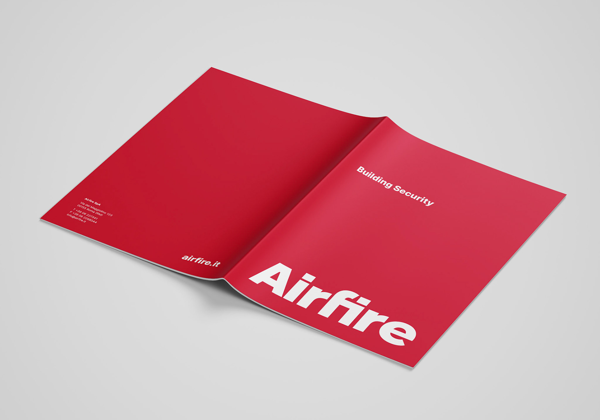
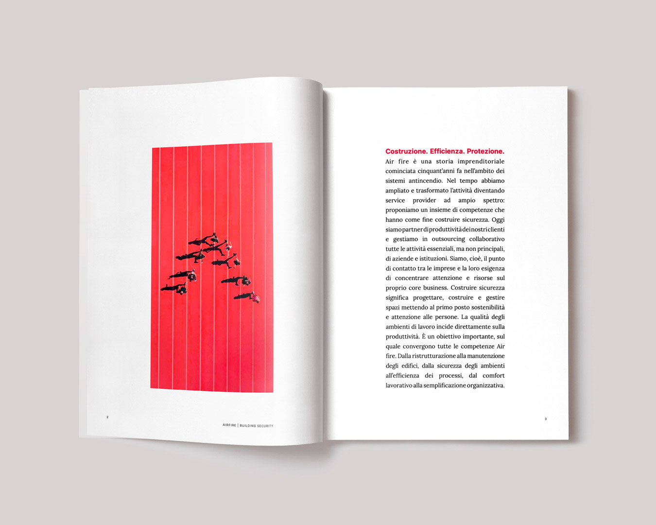
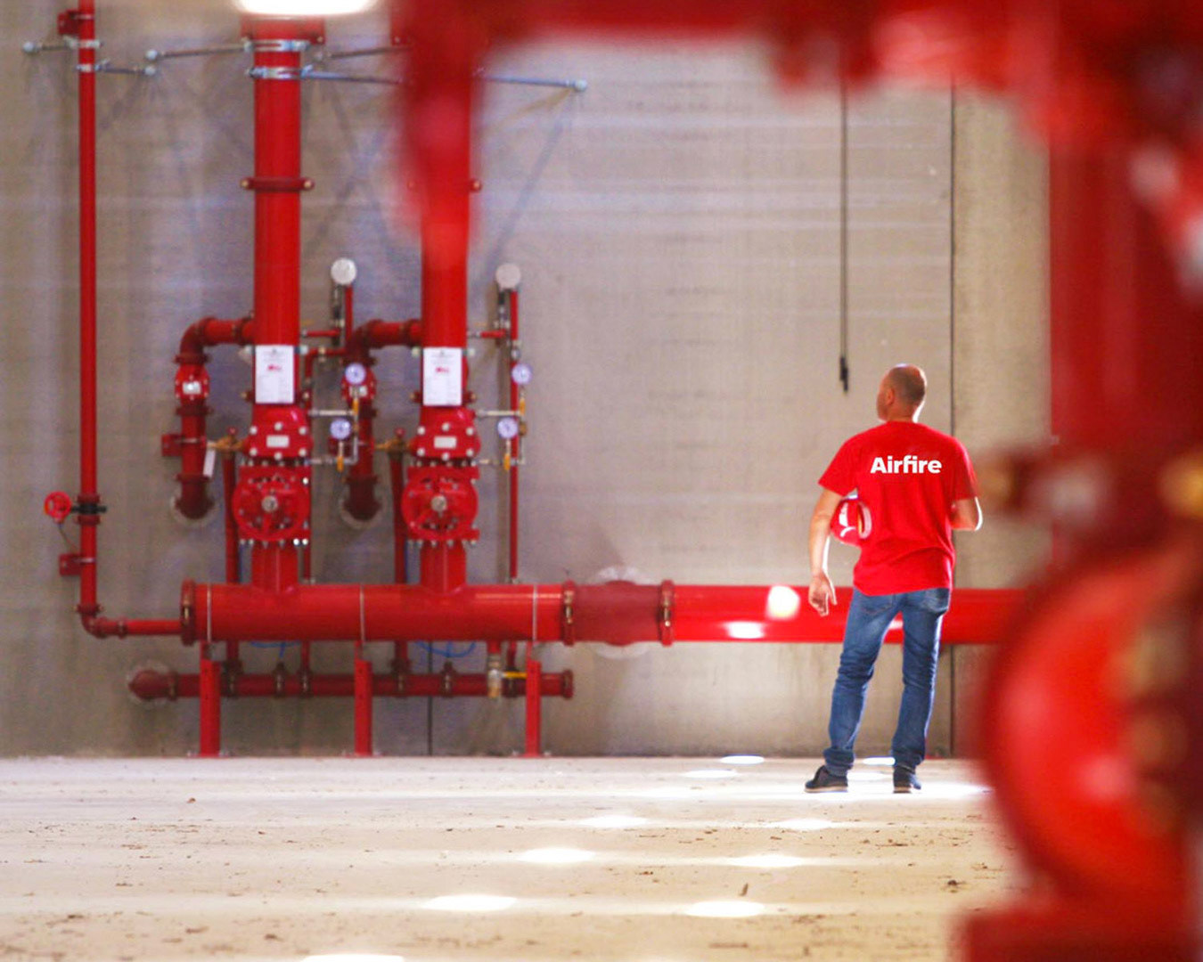
Airfire is a business story that began more than fifty years ago in the field of fire protection systems (from which the name itself derives). Over time, the company has expanded its areas of activity, transforming into a broad-spectrum service provider: its mission is summed up in the claim “Building Security.” In this perspective, Airfire is its clients’ productivity partner, managing in collaborative outsourcing all essential, though non-core, activities of institutions and companies.
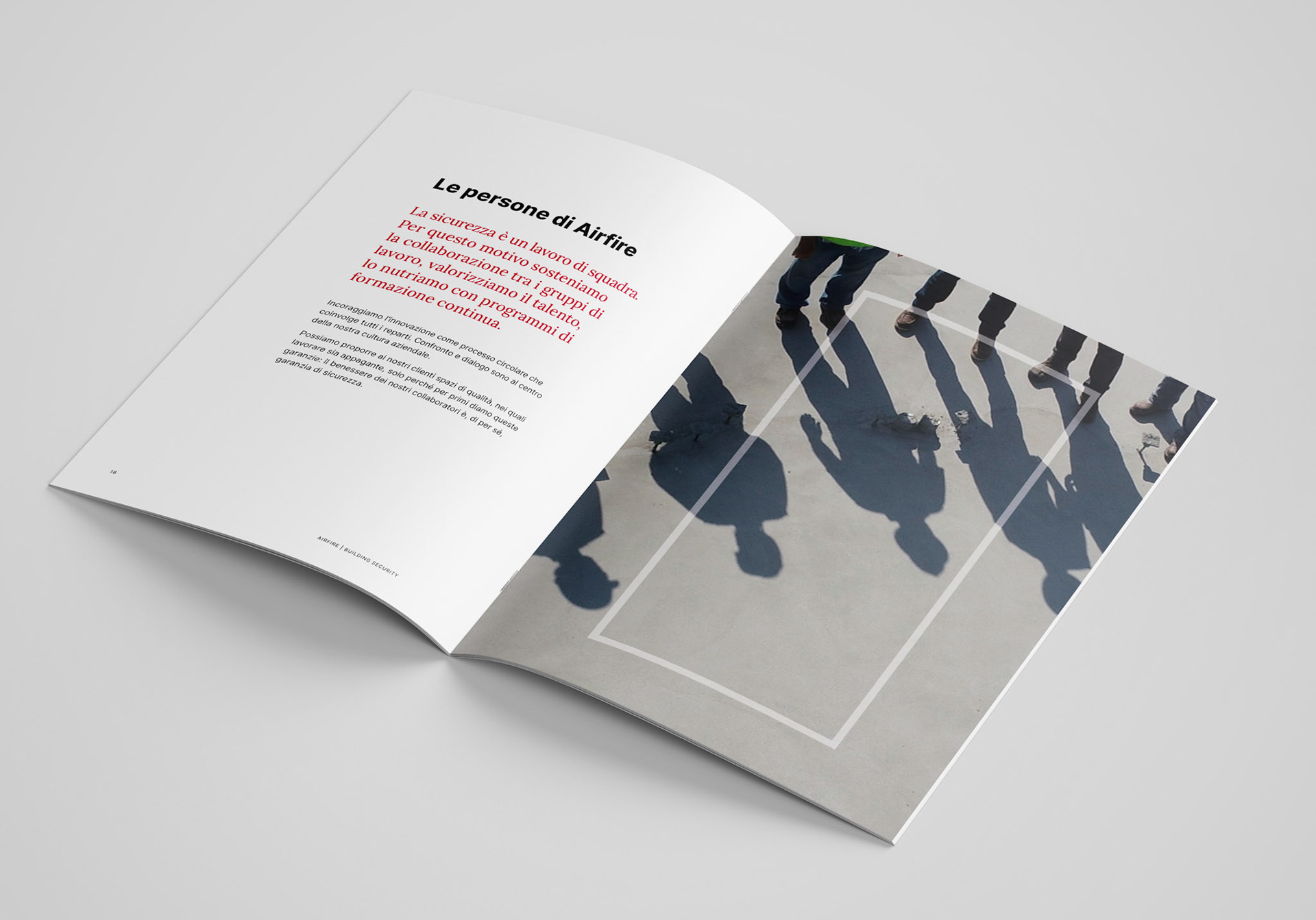
From building renovation to maintenance, from workplace safety to process efficiency, from employee comfort to organizational simplification—everything at Airfire revolves around the value of the workplace, understood as the quality of space and therefore the quality of life for the people who work in and experience it.
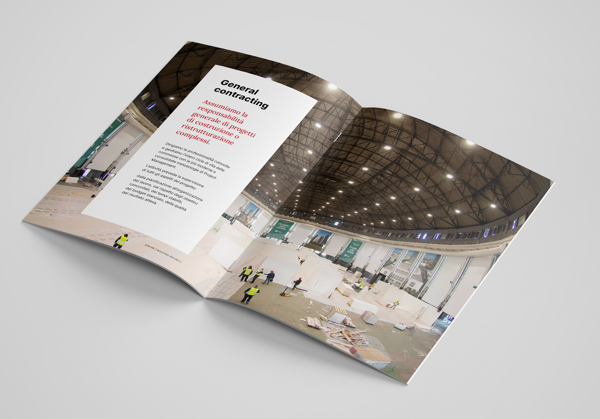
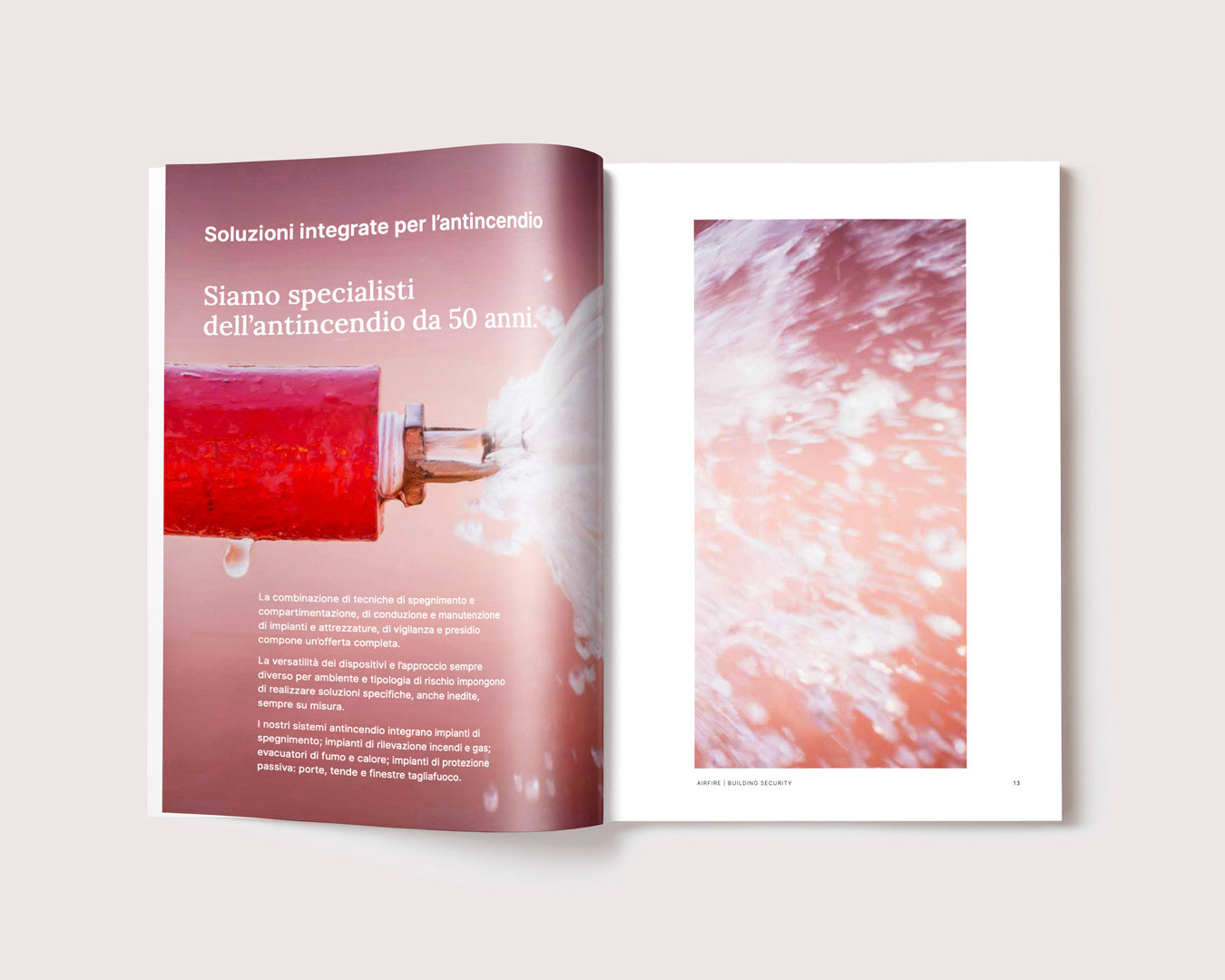
In this context, the partnership with clients is expressed through four areas:
• General contacting
• Facility management
• Integrated fire protection solutions
• Training
It is a structured, system-based approach that helps institutions and companies overcome otherwise complex management challenges, thanks to a single point of reference.
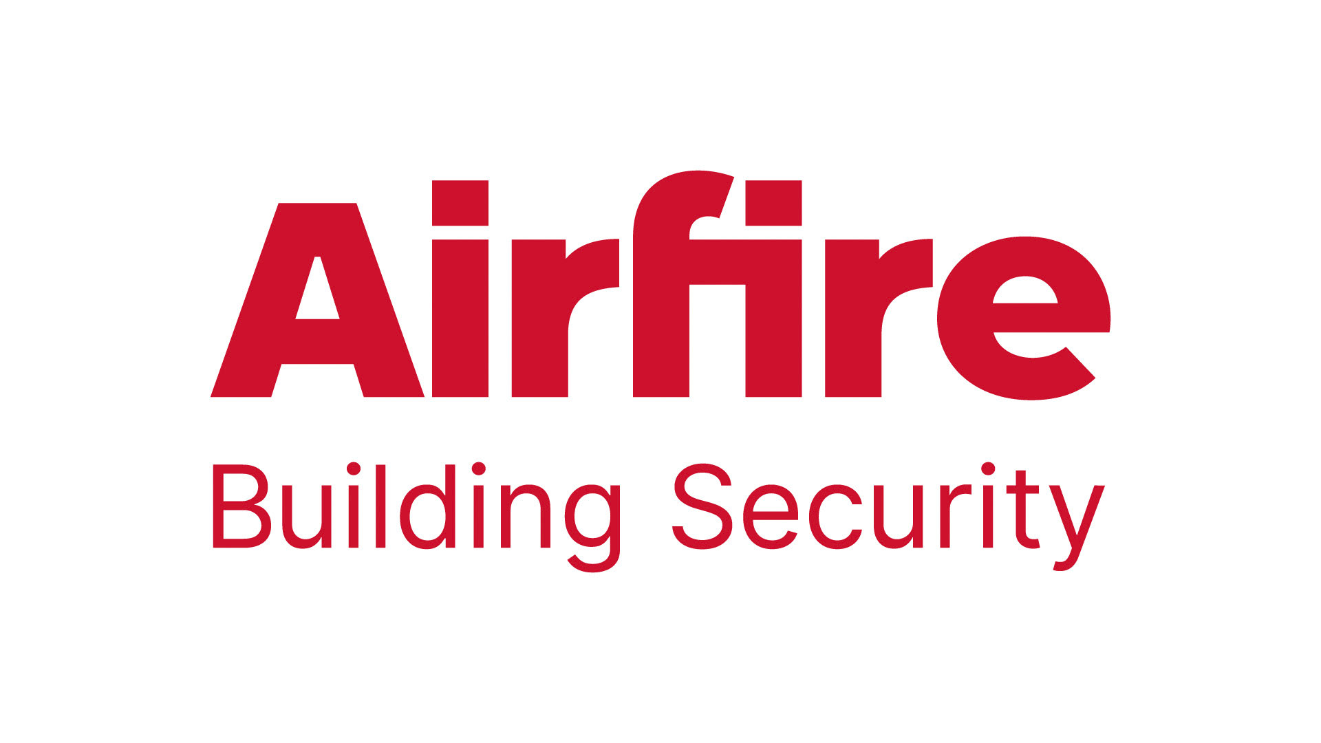
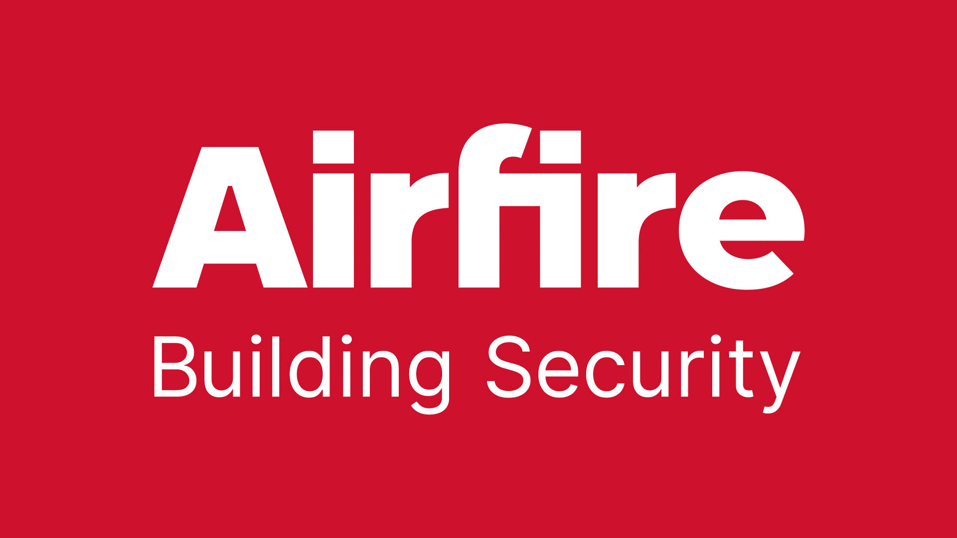
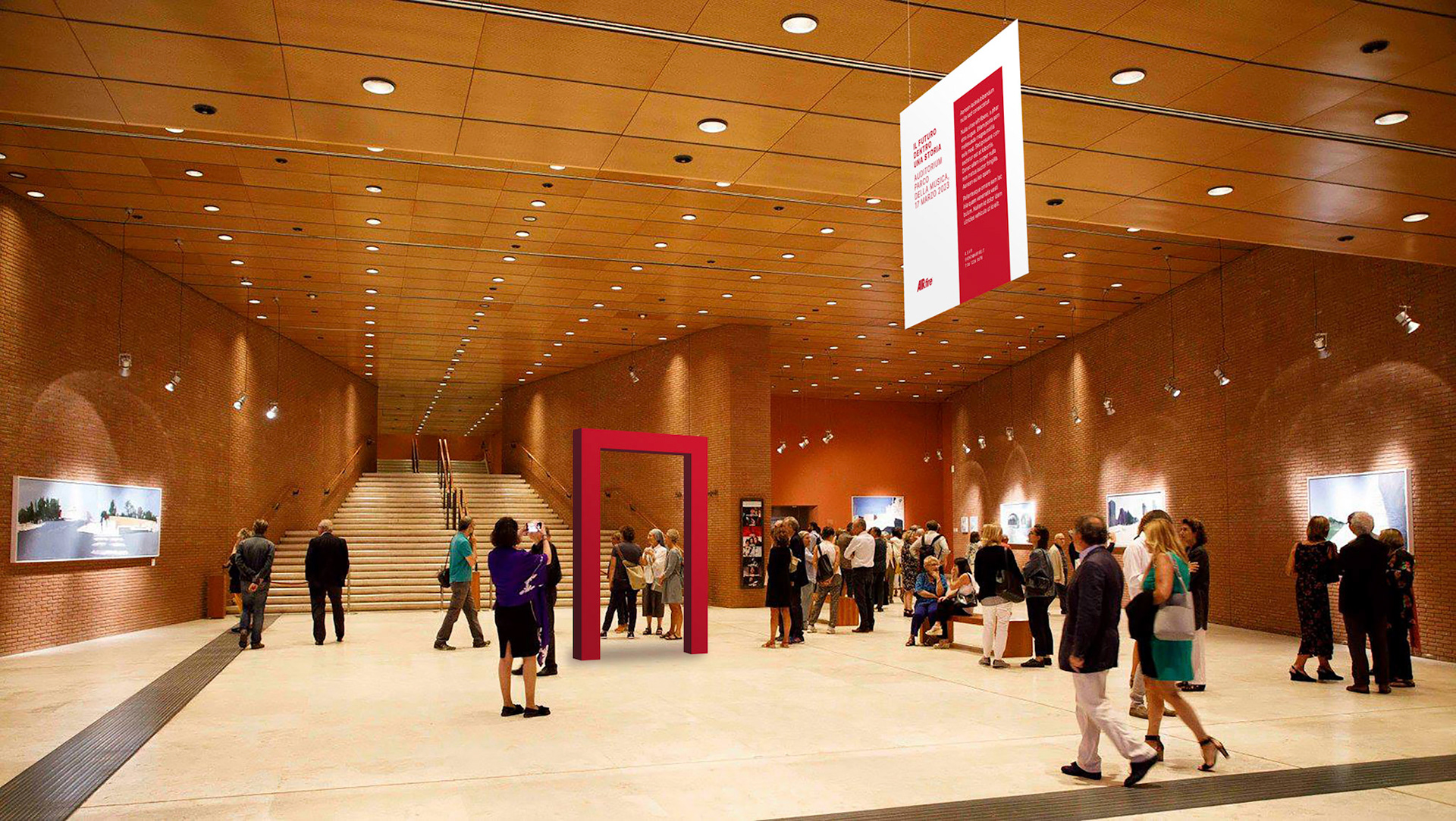
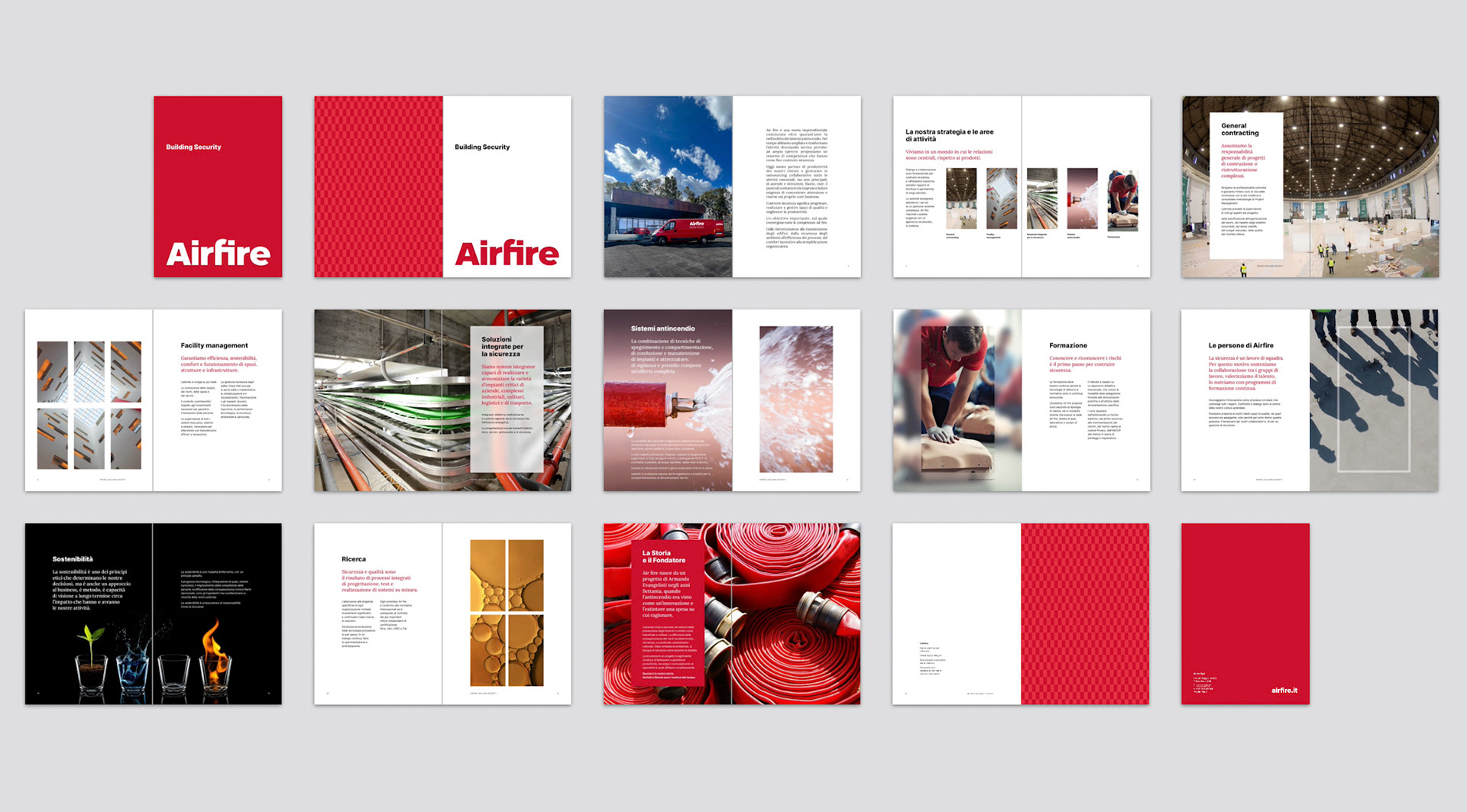
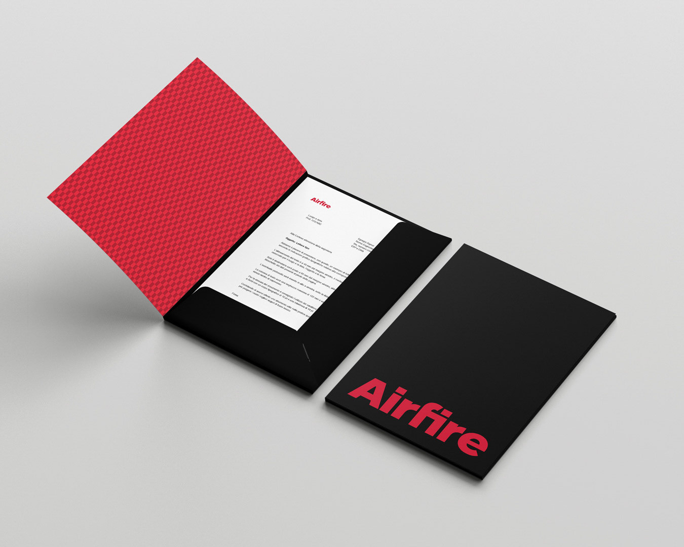
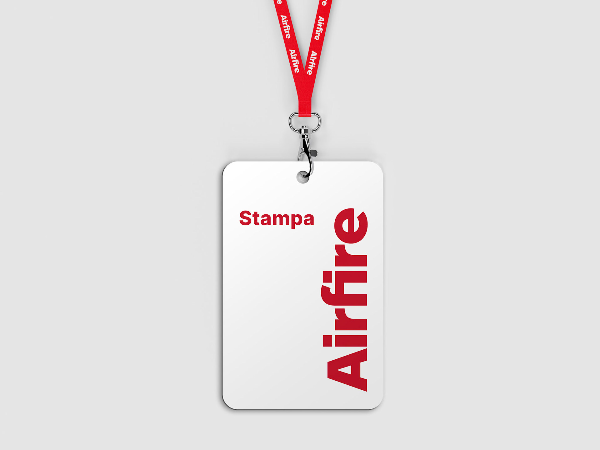
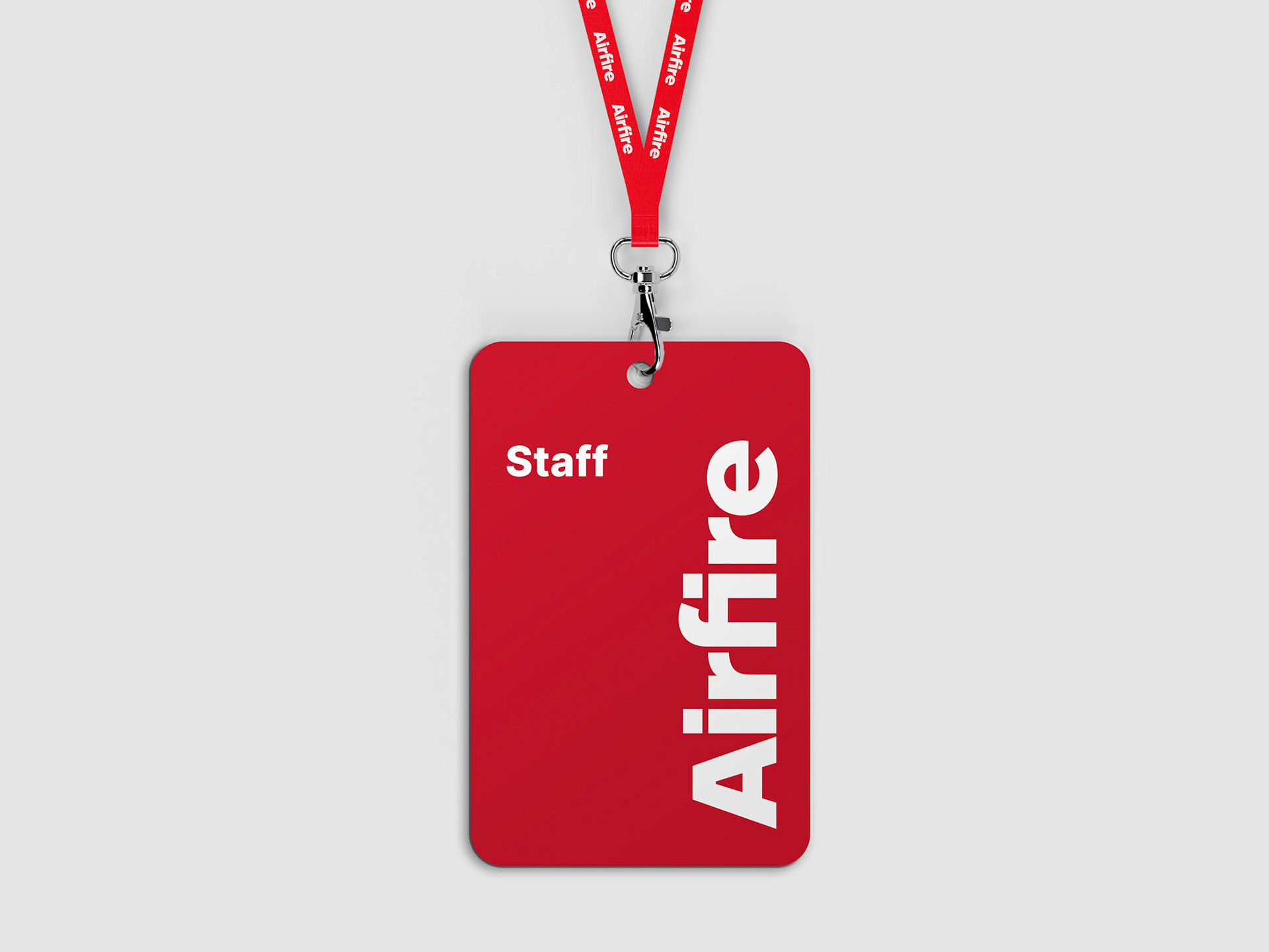
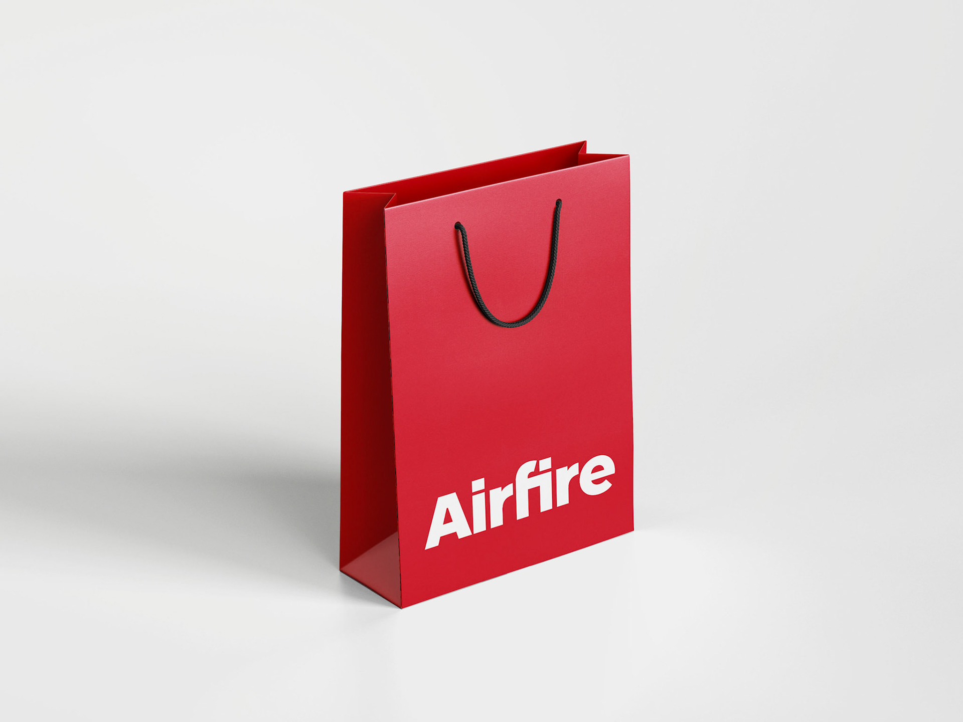
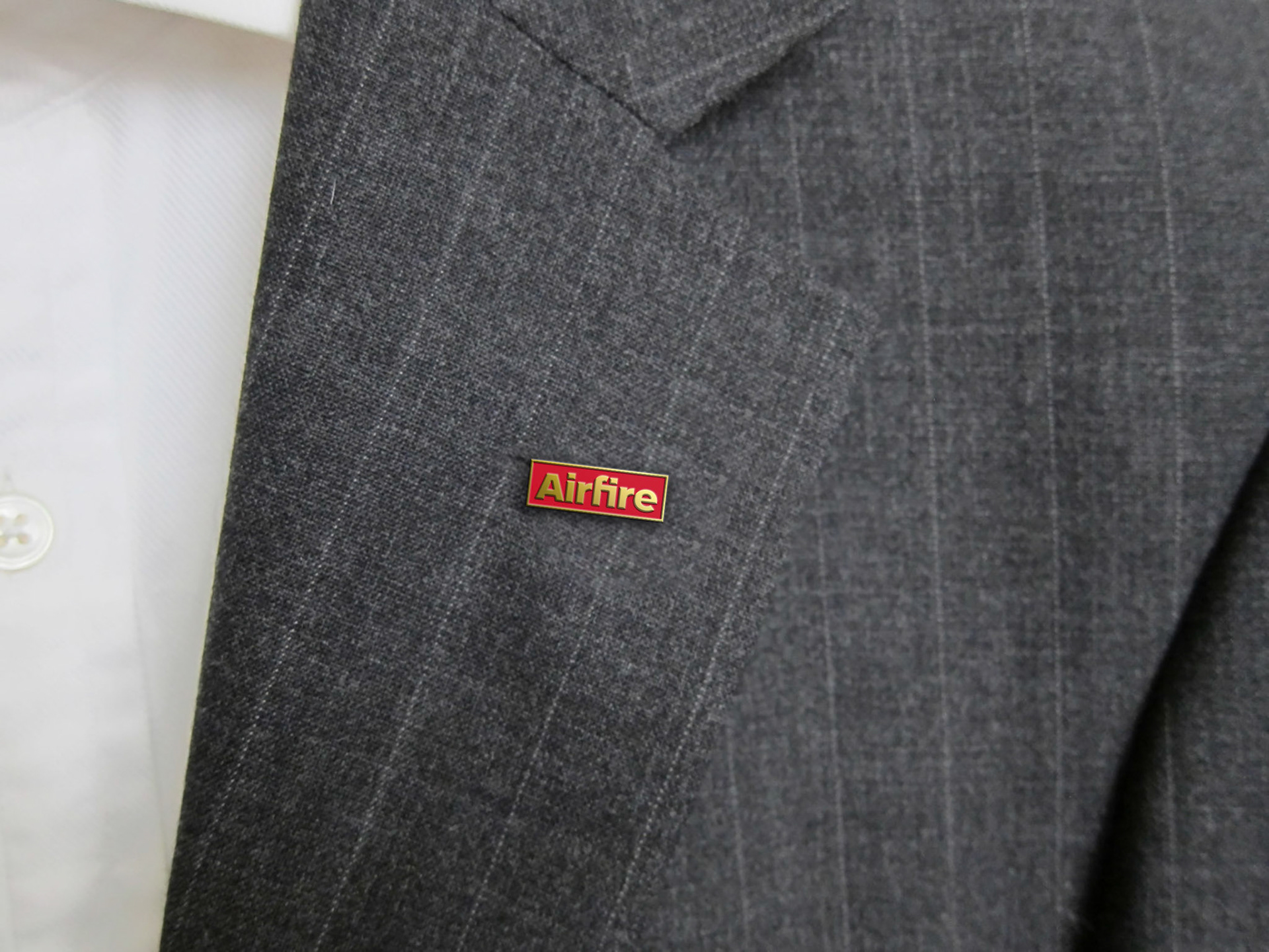
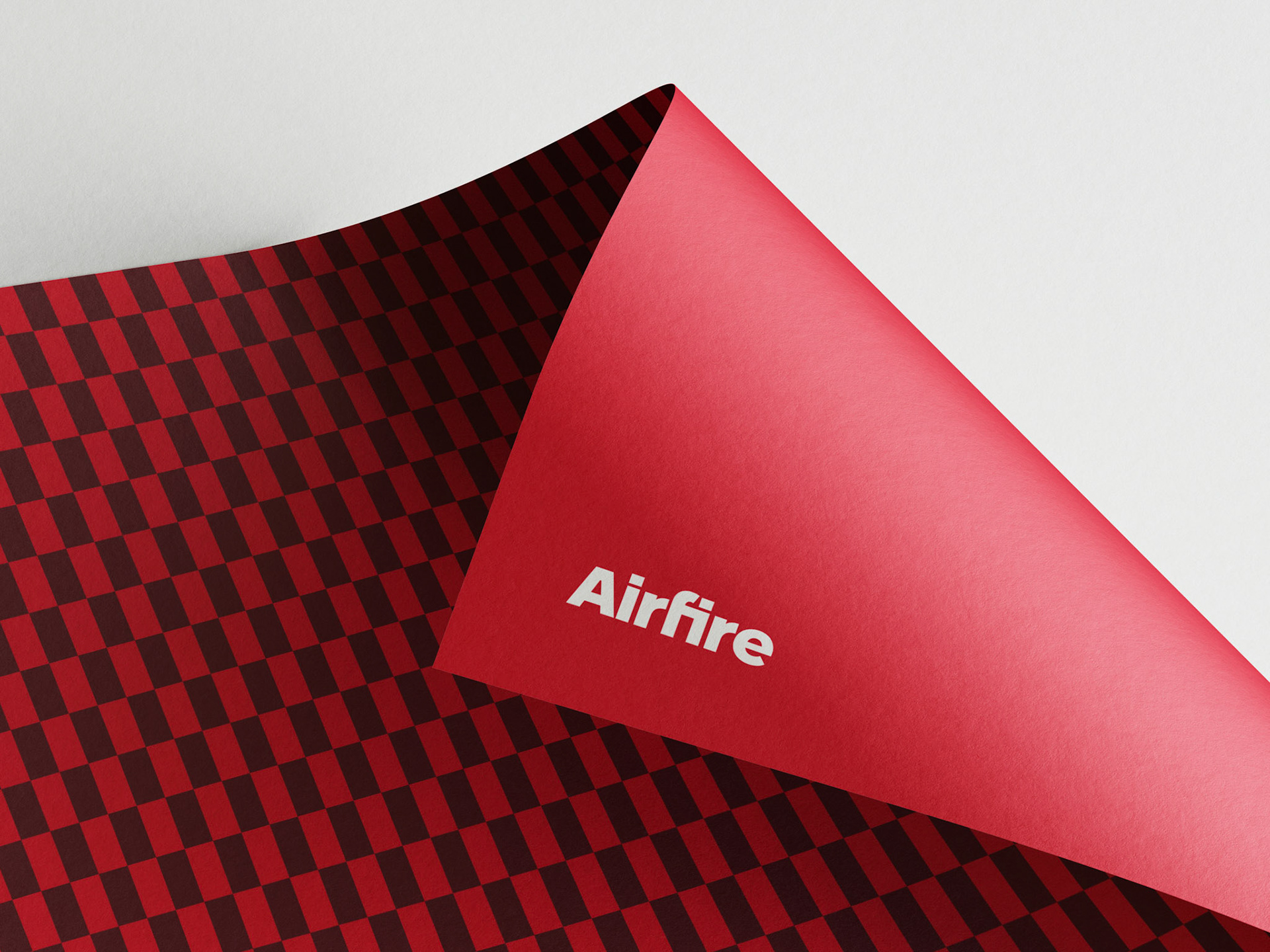
The new Airfire logotype strongly yet elegantly embodies the corporate values developed over more than fifty years of activity. The compact lettering conveys solidity and reliability, while the “f-i” ligature creates a rectangle made up of two square modules—a simple yet meaningful shape: an open door to the future, symbolizing protection and inclusion.
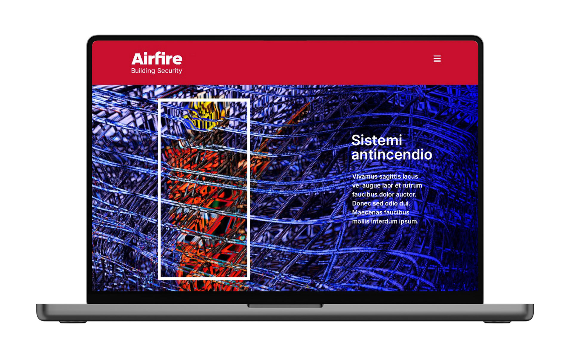
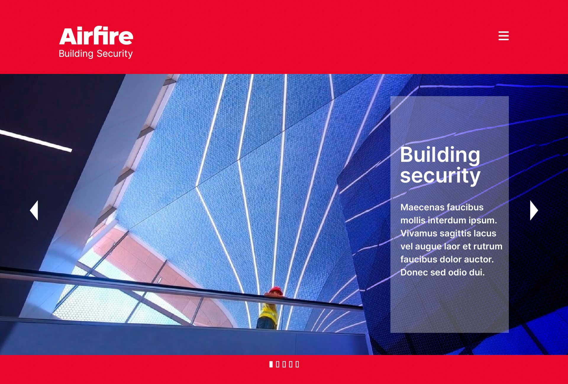
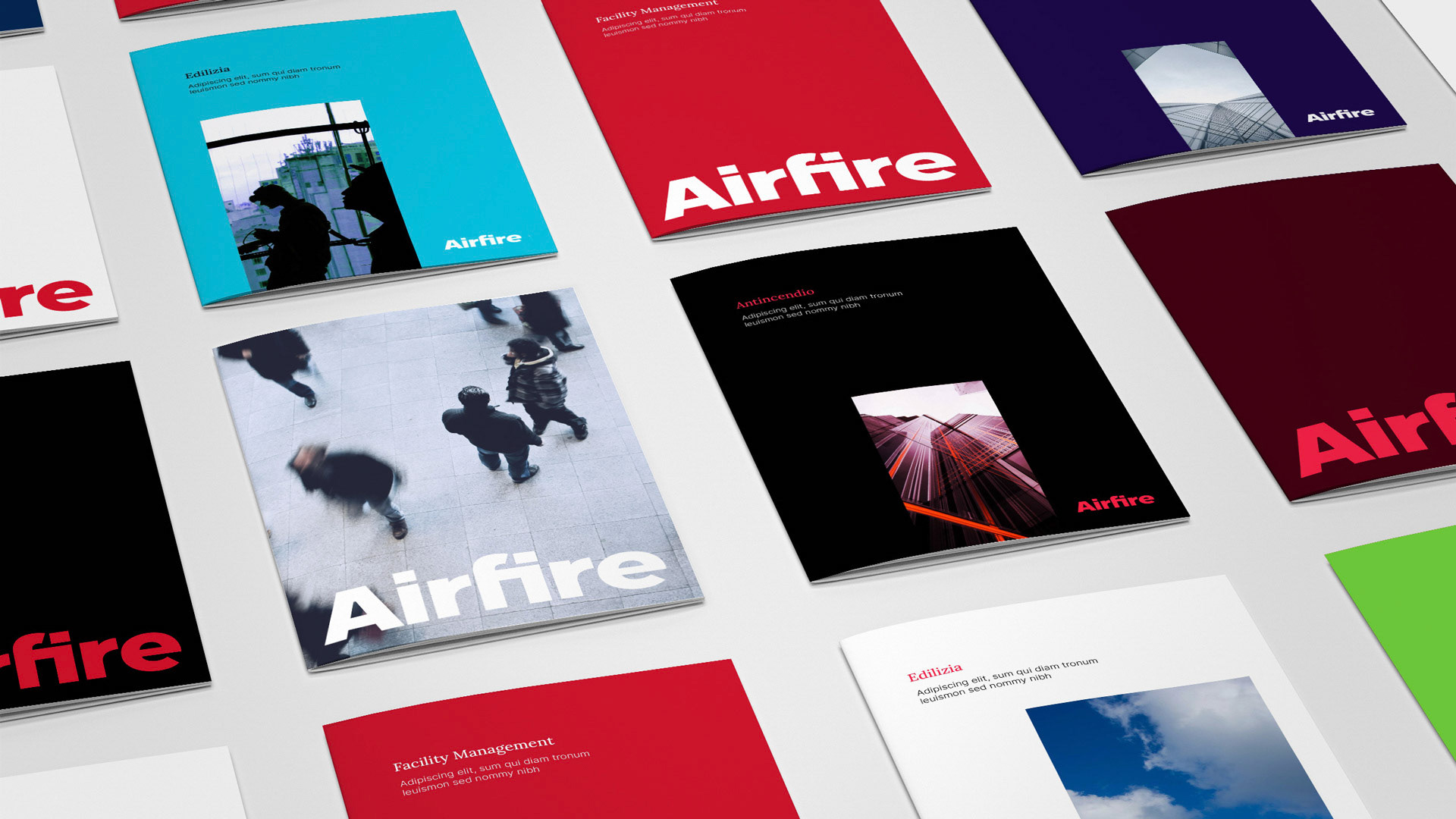
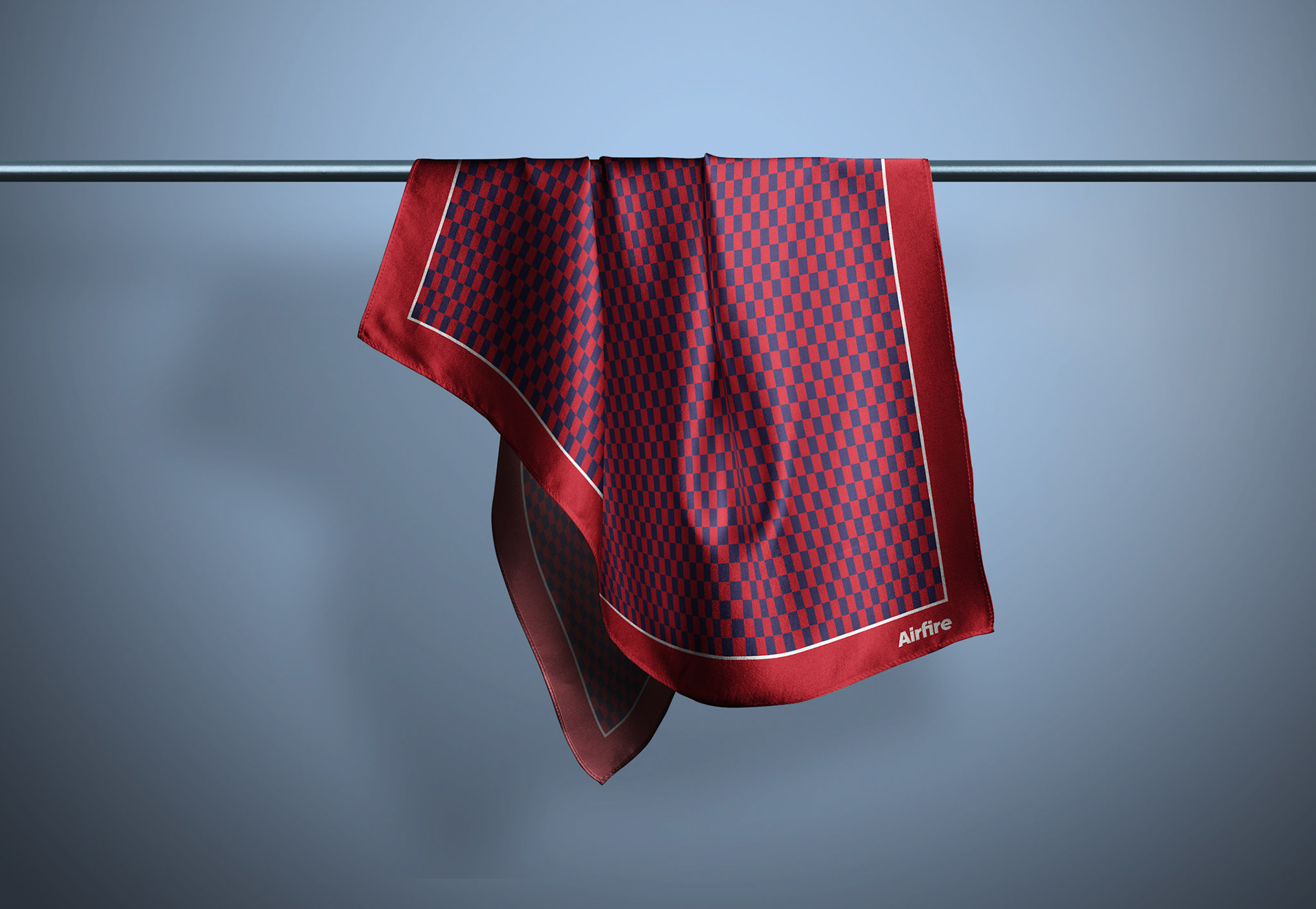
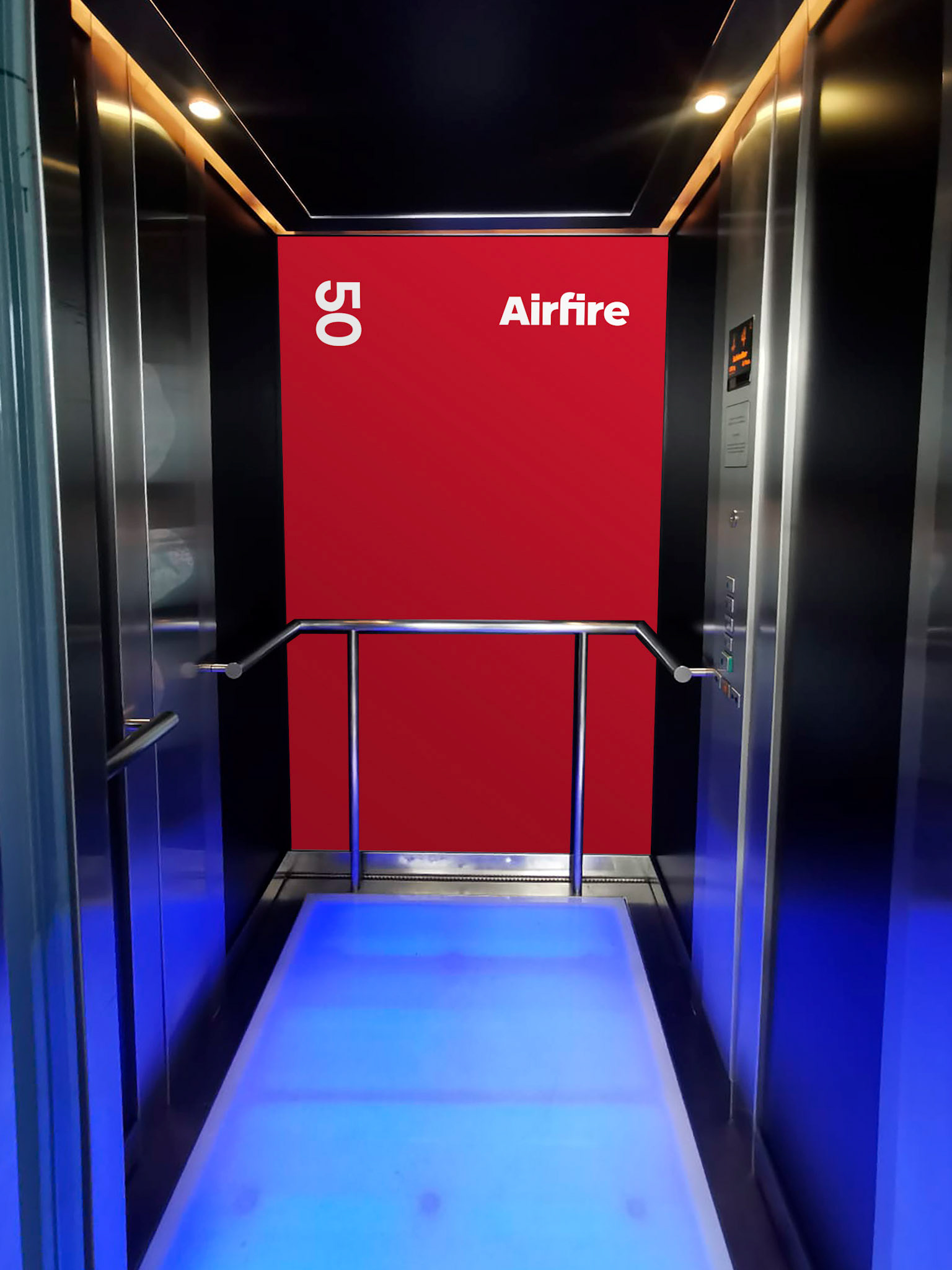
The vibrant red recalls the company’s origins and its intrinsic energy. Red, in fact, does not only evoke fire but also vitality, speed, and leadership. Around this visual core, a coherent and flexible brand design system unfolds. The rectangle/door becomes a distinctive element, adapting seamlessly to different visual contexts. The institutional color palette and light-stroke pictograms complete a brand identity that is essential in form yet highly recognizable.
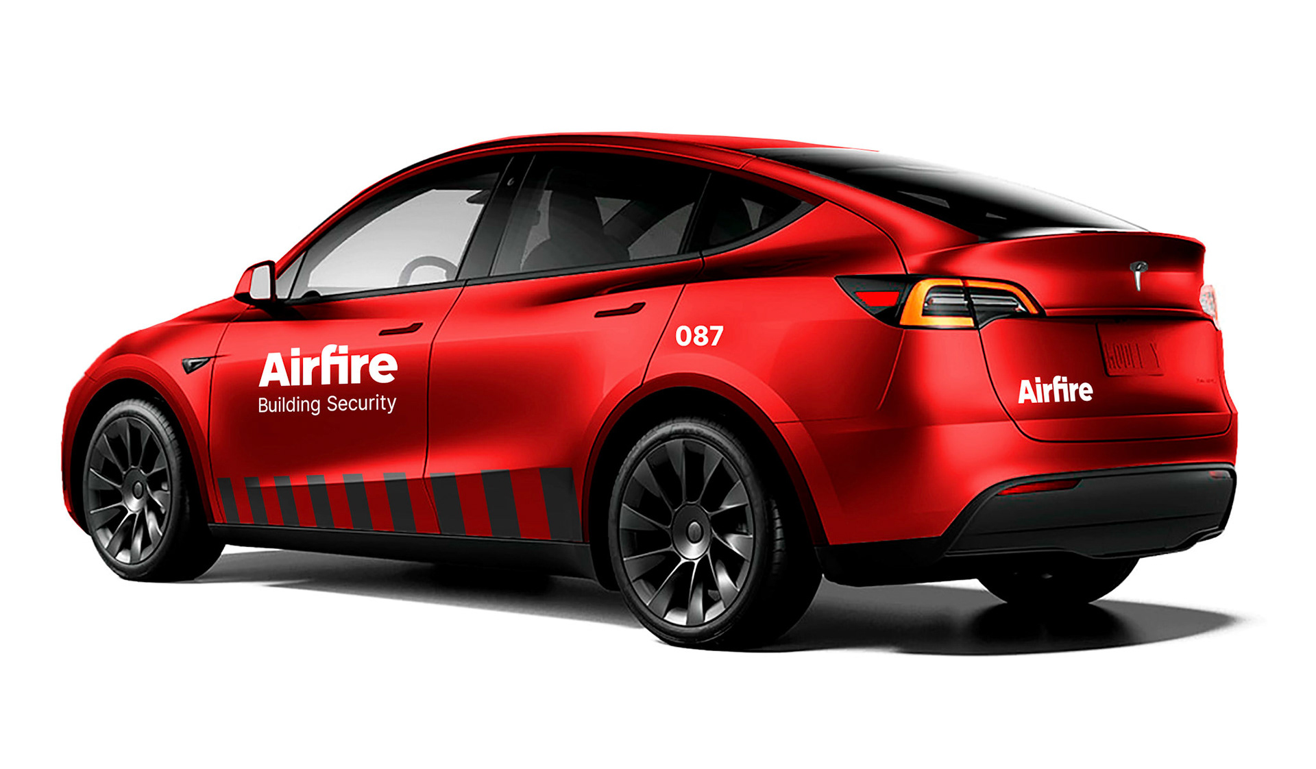
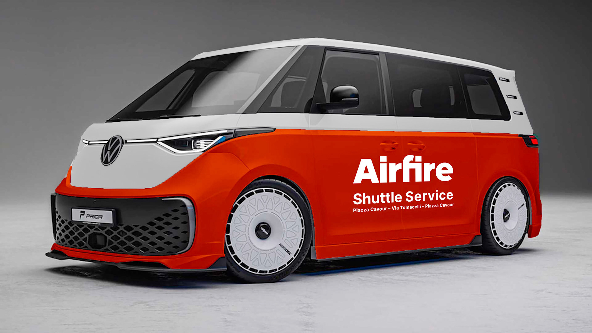
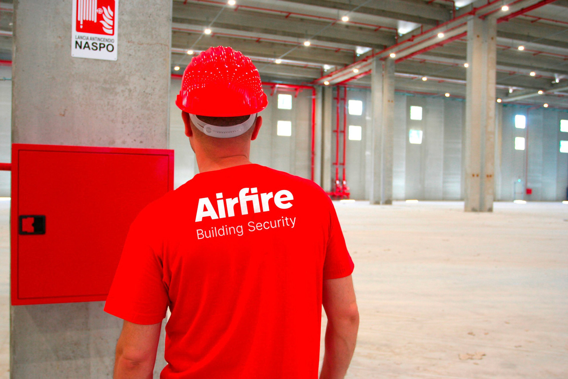
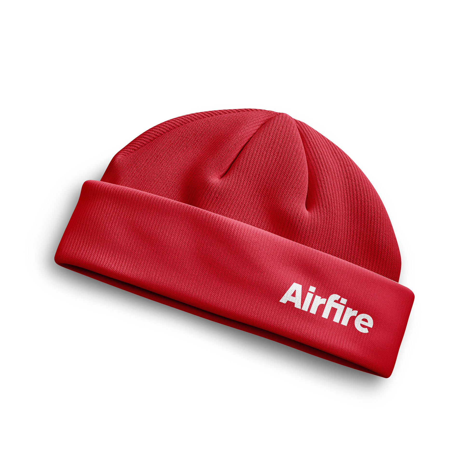
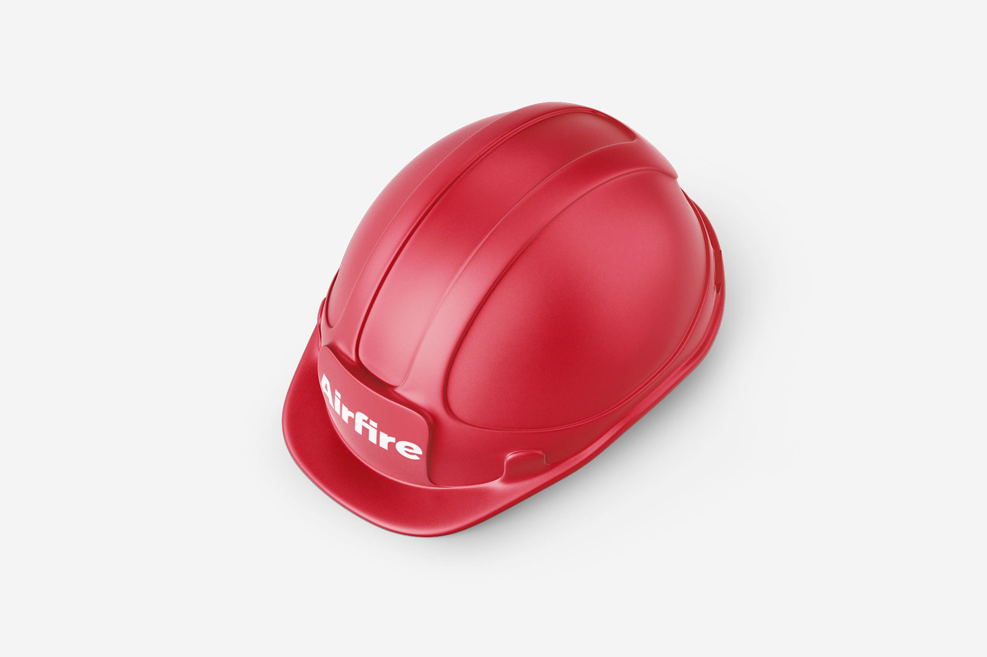
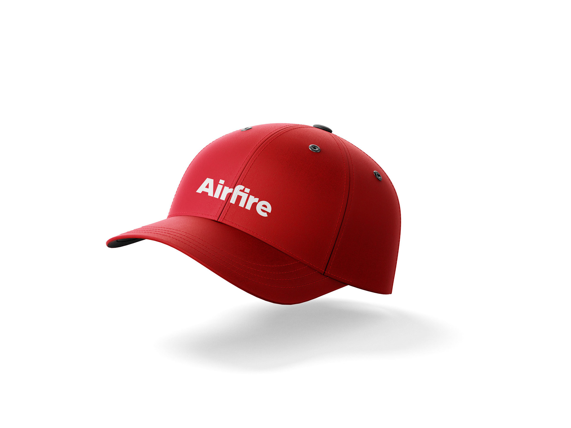
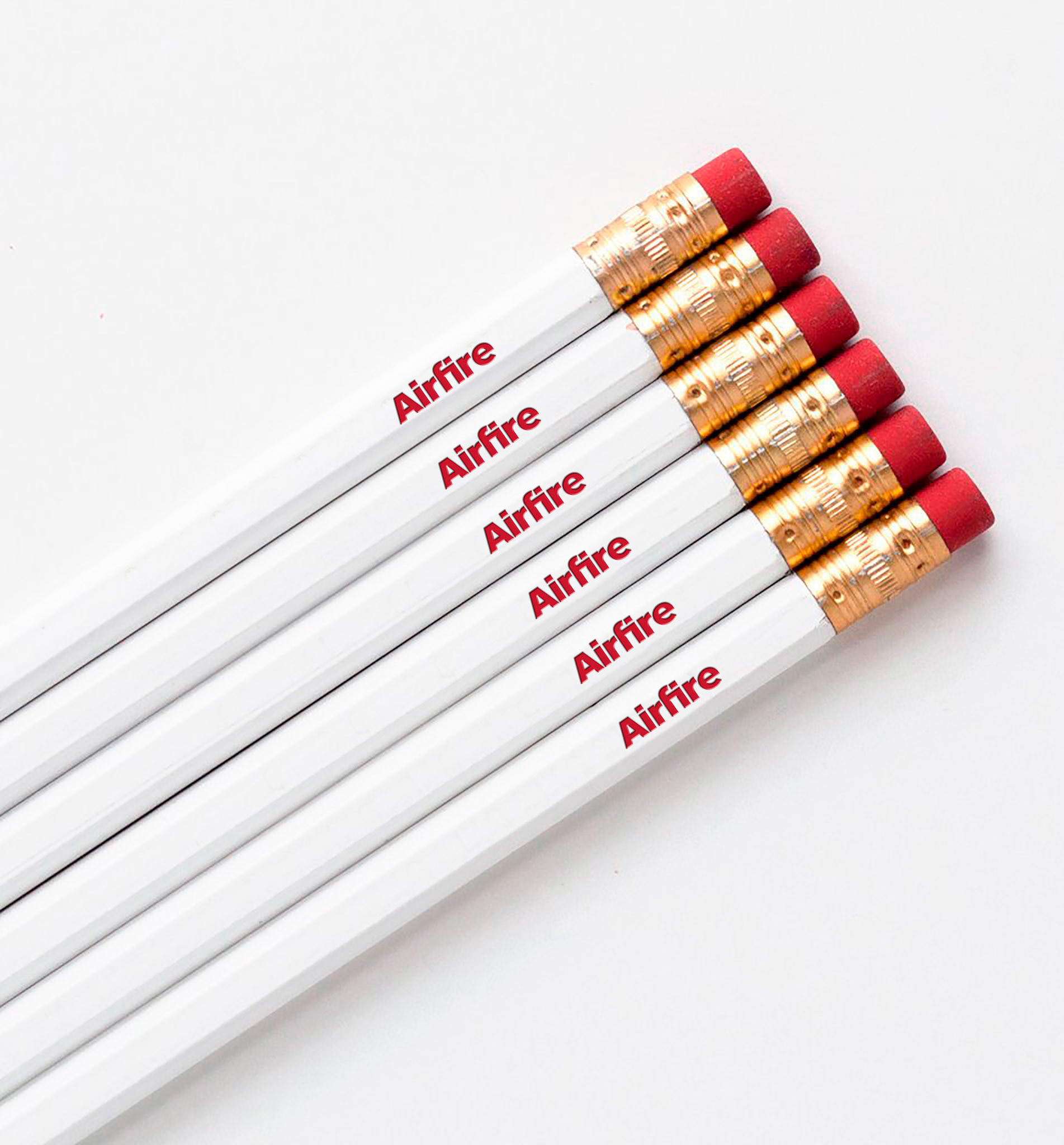
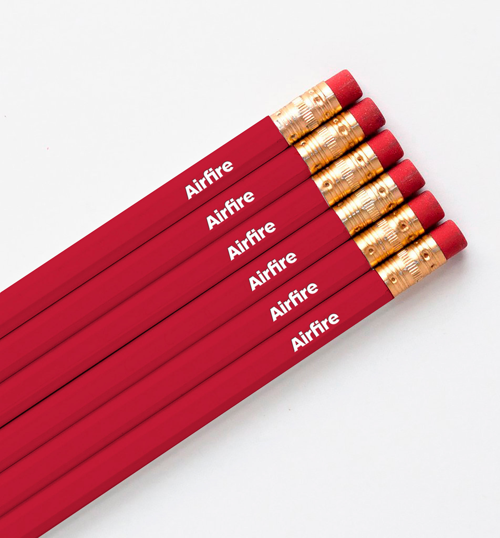
The renewal of the corporate identity has involved all major communication tools: clothing and uniforms, signage, vehicle liveries, institutional and commercial brochures, forms, event materials, and corporate videos. The launch of the new brand identity was incorporated into the event celebrating the company’s fiftieth anniversary, marked by a commemorative logo paired with the new institutional one—underlining both the value of the company’s roots and its forward-looking vision.
From building renovation to maintenance, from workplace safety to process efficiency, from employee comfort to organizational simplification—everything at Airfire revolves around the value of the workplace, understood as the quality of space and therefore the quality of life for the people who work in and experience it.
In this context, the partnership with clients is expressed through four areas:
• General contacting
• Facility management
• Integrated fire protection solutions
• Training
It is a structured, system-based approach that helps institutions and companies overcome otherwise complex management challenges, thanks to a single point of reference.
The new Airfire logotype strongly yet elegantly embodies the corporate values developed over more than fifty years of activity. The compact lettering conveys solidity and reliability, while the “f-i” ligature creates a rectangle made up of two square modules—a simple yet meaningful shape: an open door to the future, symbolizing protection and inclusion.
The vibrant red recalls the company’s origins and its intrinsic energy. Red, in fact, does not only evoke fire but also vitality, speed, and leadership. Around this visual core, a coherent and flexible brand design system unfolds. The rectangle/door becomes a distinctive element, adapting seamlessly to different visual contexts. The institutional color palette and light-stroke pictograms complete a brand identity that is essential in form yet highly recognizable.
The renewal of the corporate identity has involved all major communication tools: clothing and uniforms, signage, vehicle liveries, institutional and commercial brochures, forms, event materials, and corporate videos. The launch of the new brand identity was incorporated into the event celebrating the company’s fiftieth anniversary, marked by a commemorative logo paired with the new institutional one—underlining both the value of the company’s roots and its forward-looking vision.


Client:
Airfire SpA
Sector:
B2B / Maintenance and Facility Management
Country and Date:
Italy, 2024
Team:
Client Director: Tiziana Brandia
Design Director: Chris Scherer
Art Director: Sara Callini
Motion Designer: Antonio Viscelia
Agency:
Inarea Identity Design, Rome
Design Disciplines:
• Brand & Identity Design
• Brand Architecture
• Brand Communication
• Brand Personality Building
• Editorial Design
• Signage & Wayfinding Design
• Web & Digital Design
• Brand Design Manual
• Brand Design Manual