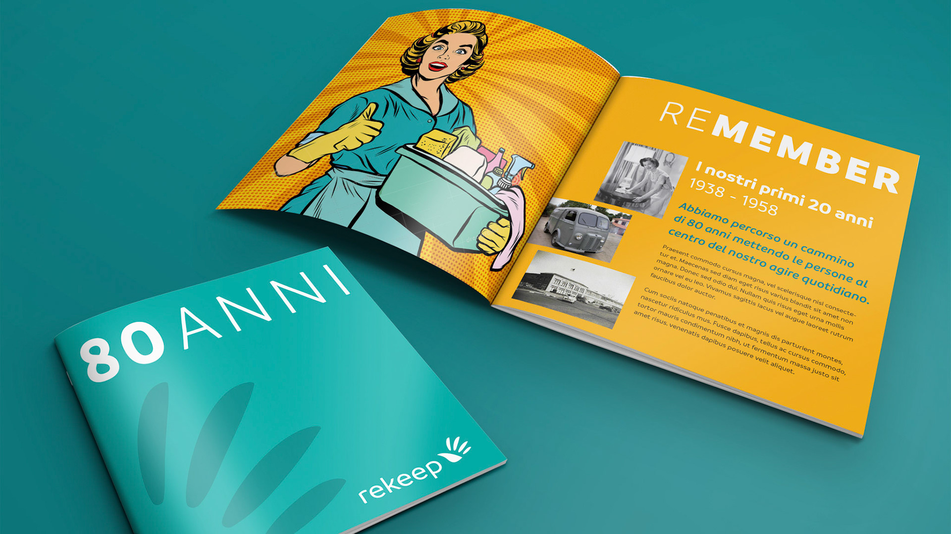
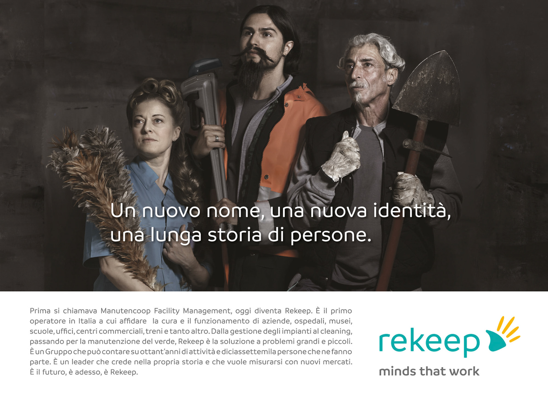
Founded in 1938 by 16 workers as a cooperative for the Ferrovie dello Stato in Bologna, Rekeep, formerly known as Manutencoop, is now Italian leader and one of the main European players in Maintenance and Facility Management.
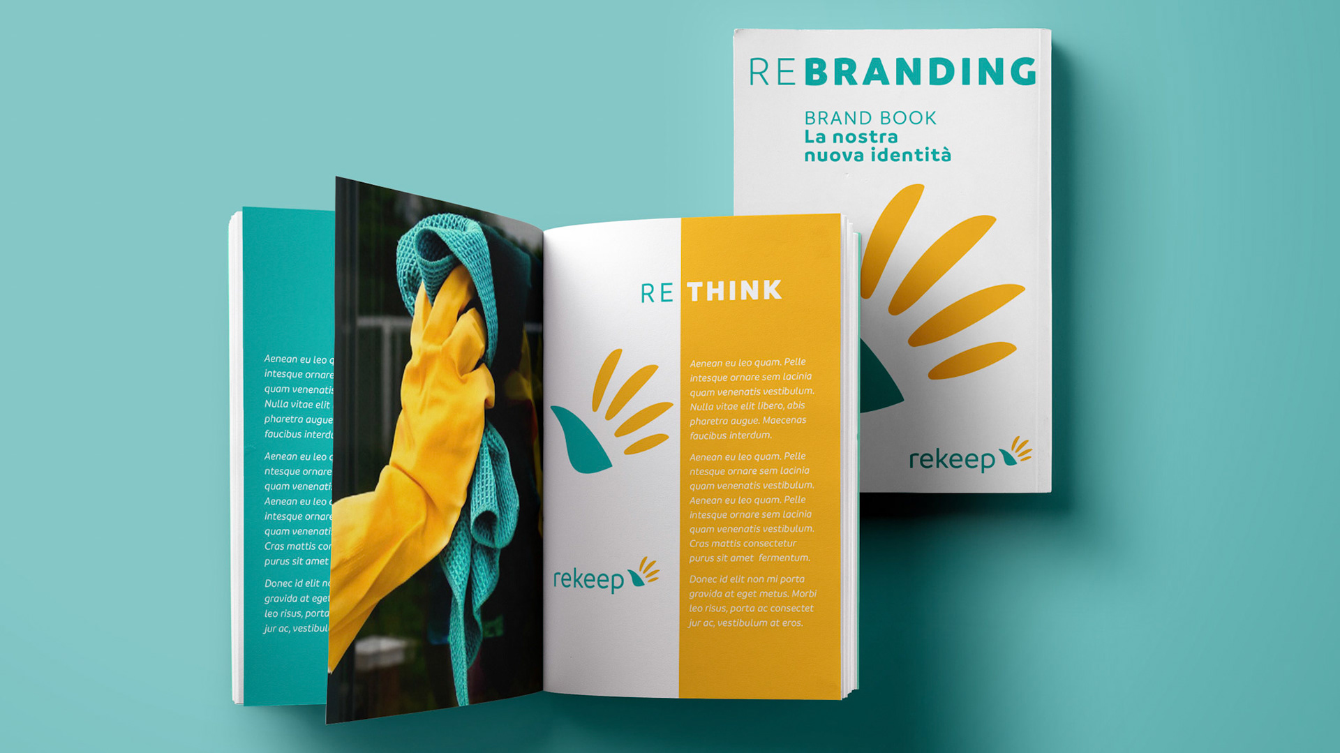
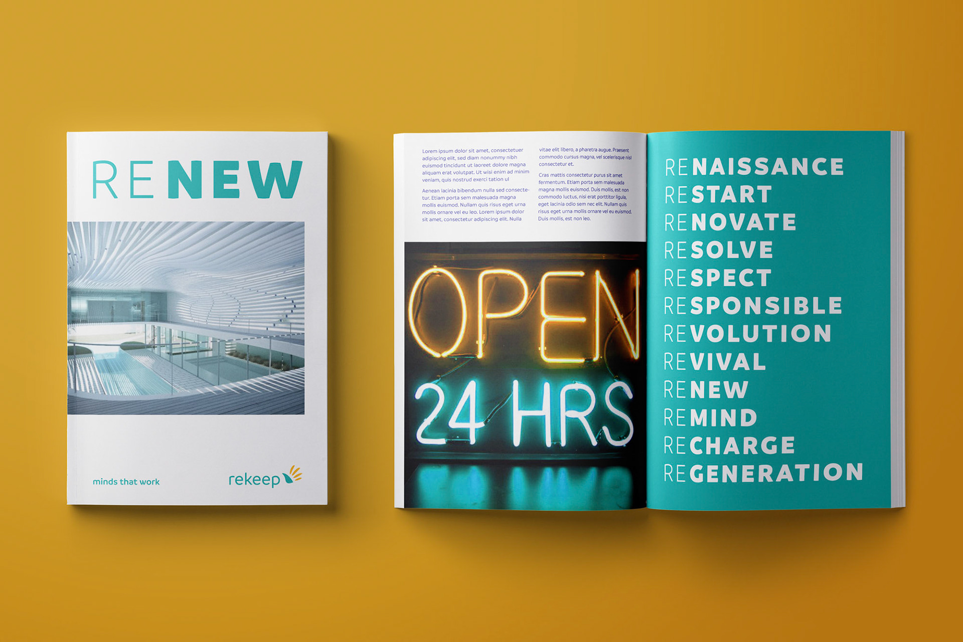
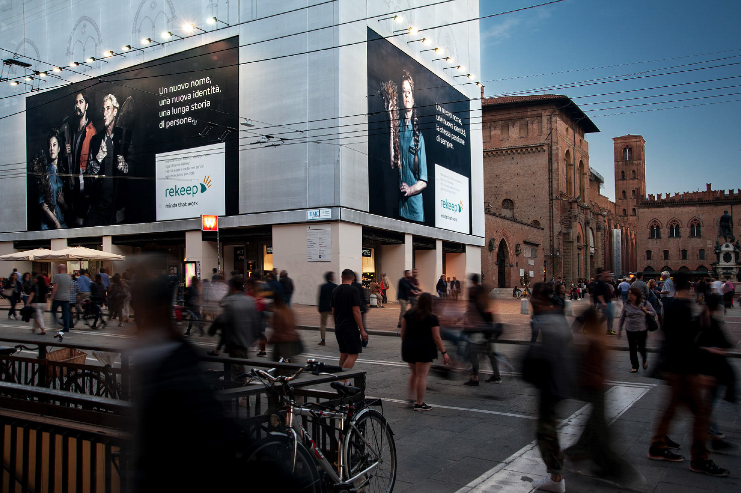
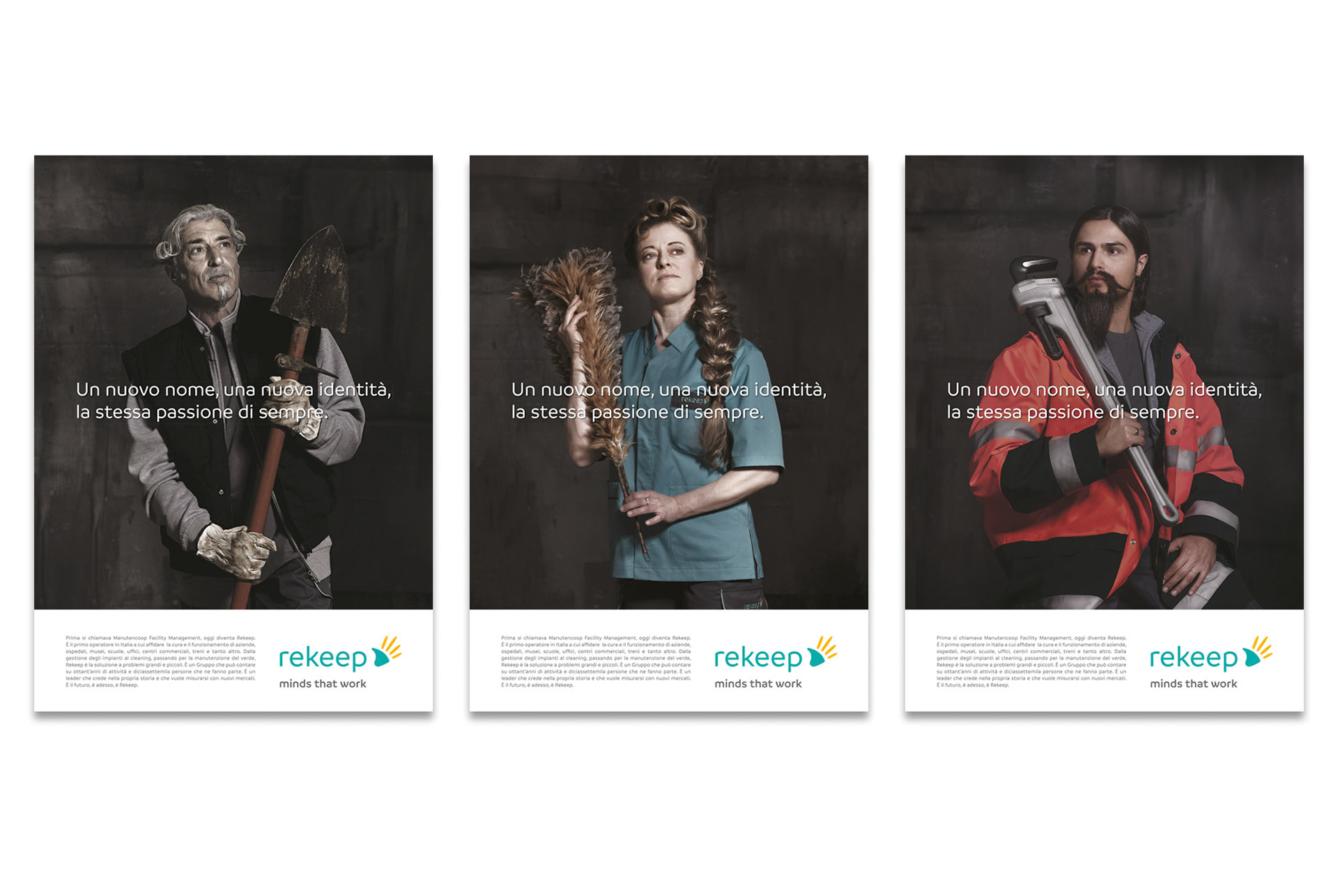
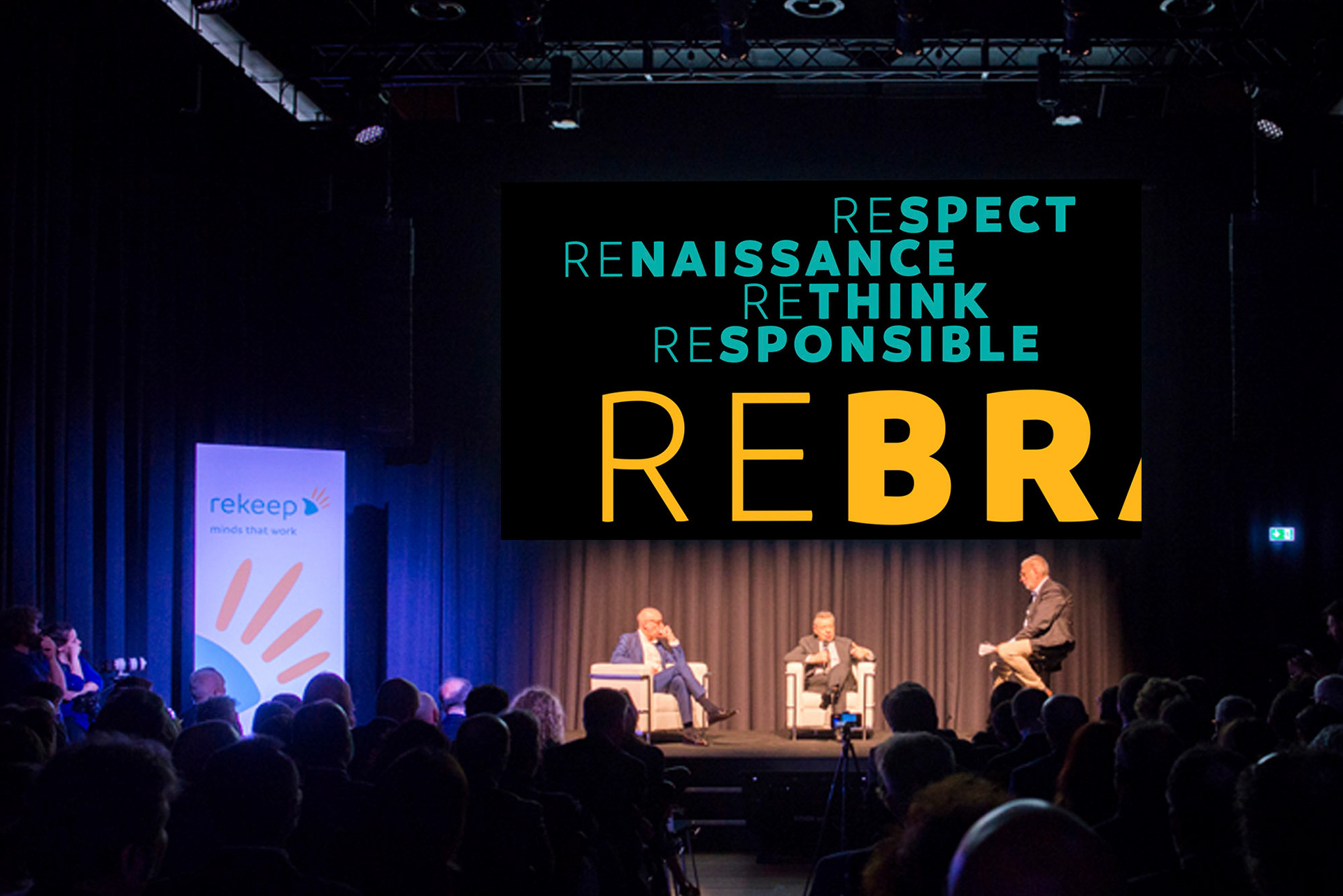
A new name and a new identity to enrich and innovate its skills, and to widen the geographical boundaries of its market. A new challenge to translate a story into an idea of the future.
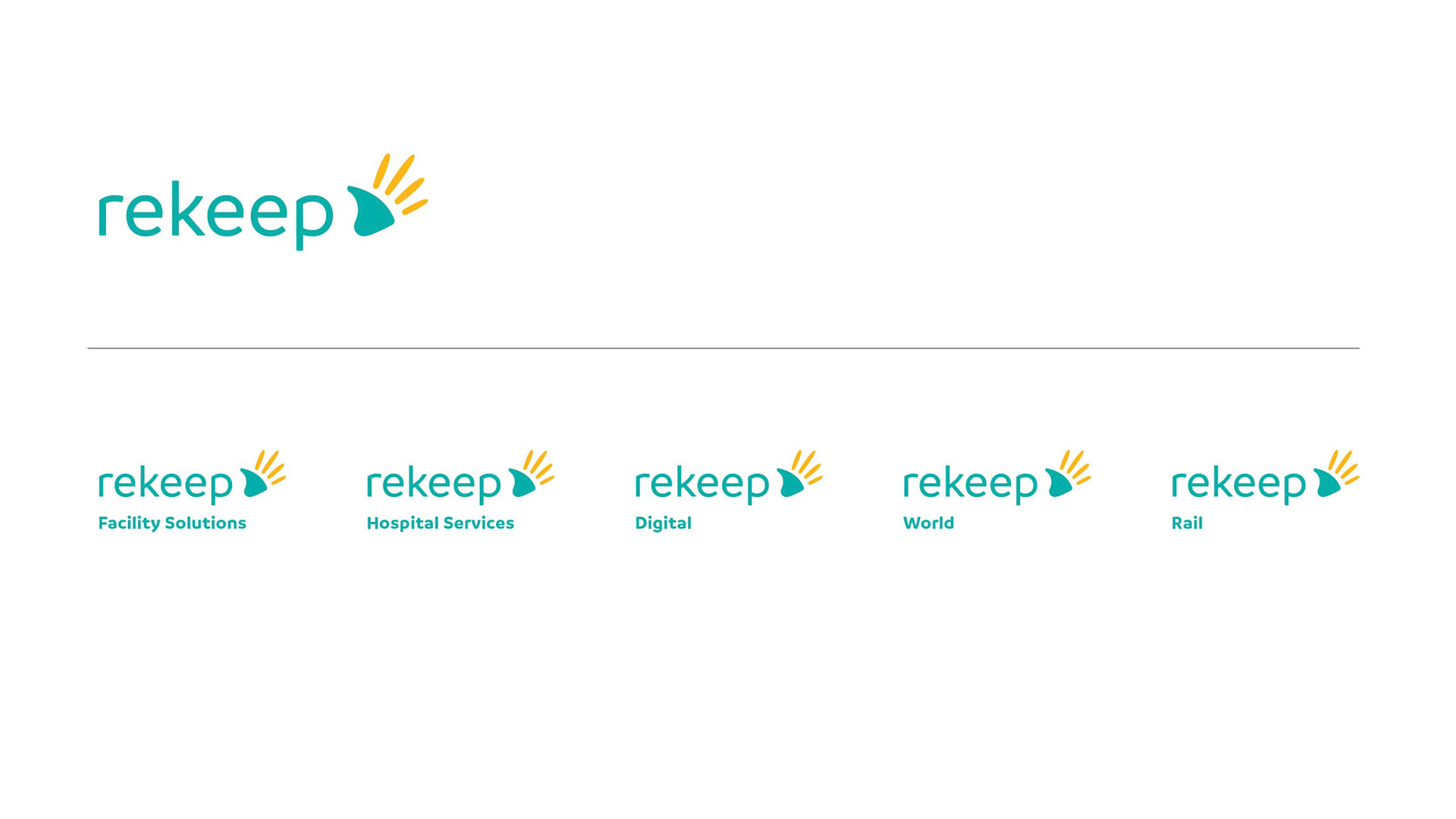
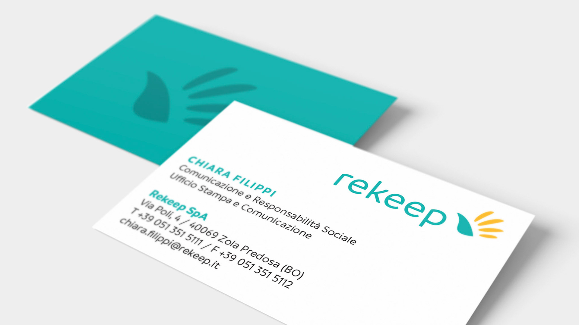
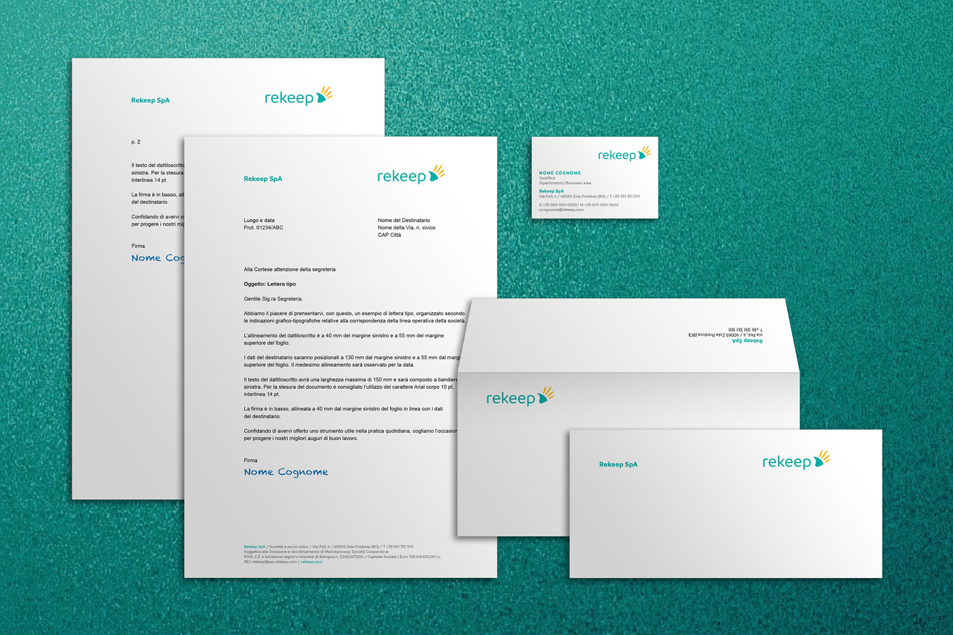
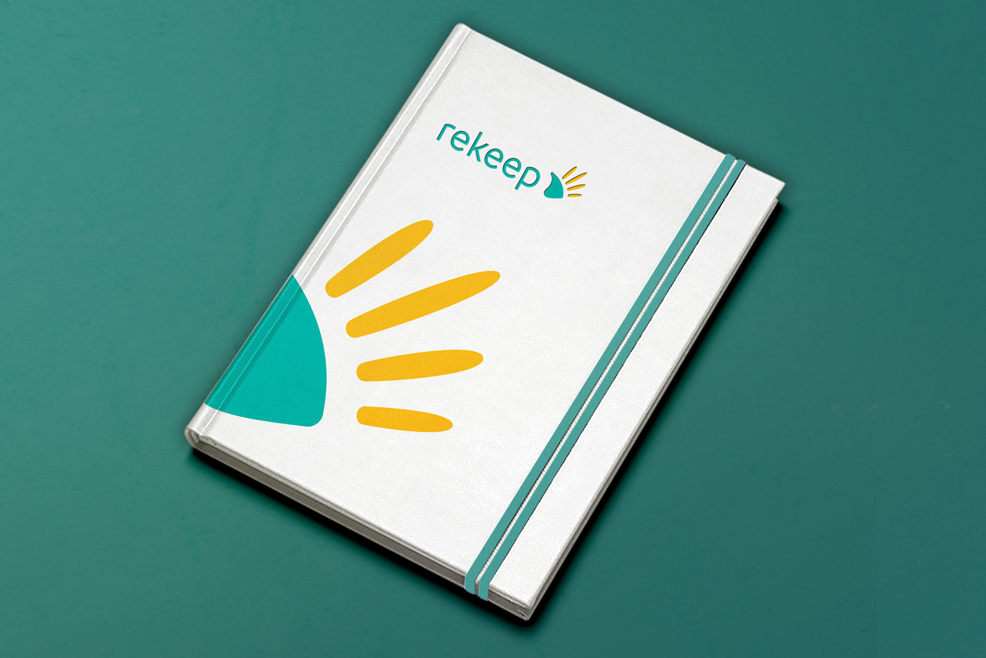
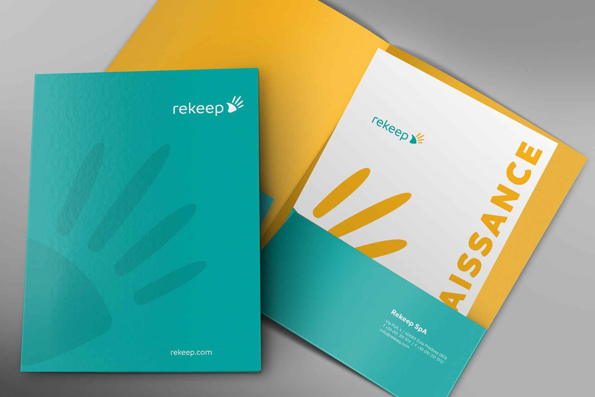
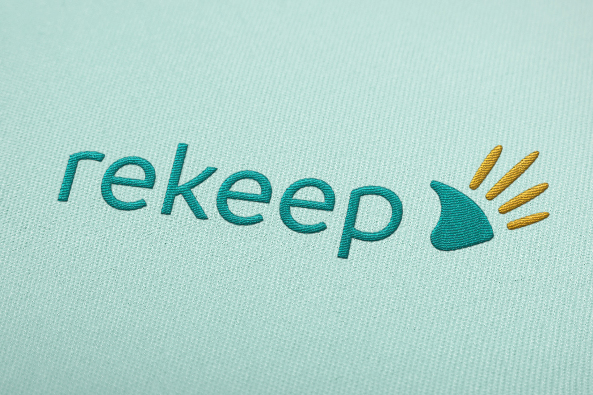
The new name is represented with a contemporary typographic character, simple and with letters composed in lower case, to underline the friendly and direct tone. The colours turquoise and yellow were chosen to underline the idea of cleanliness and efficiency.
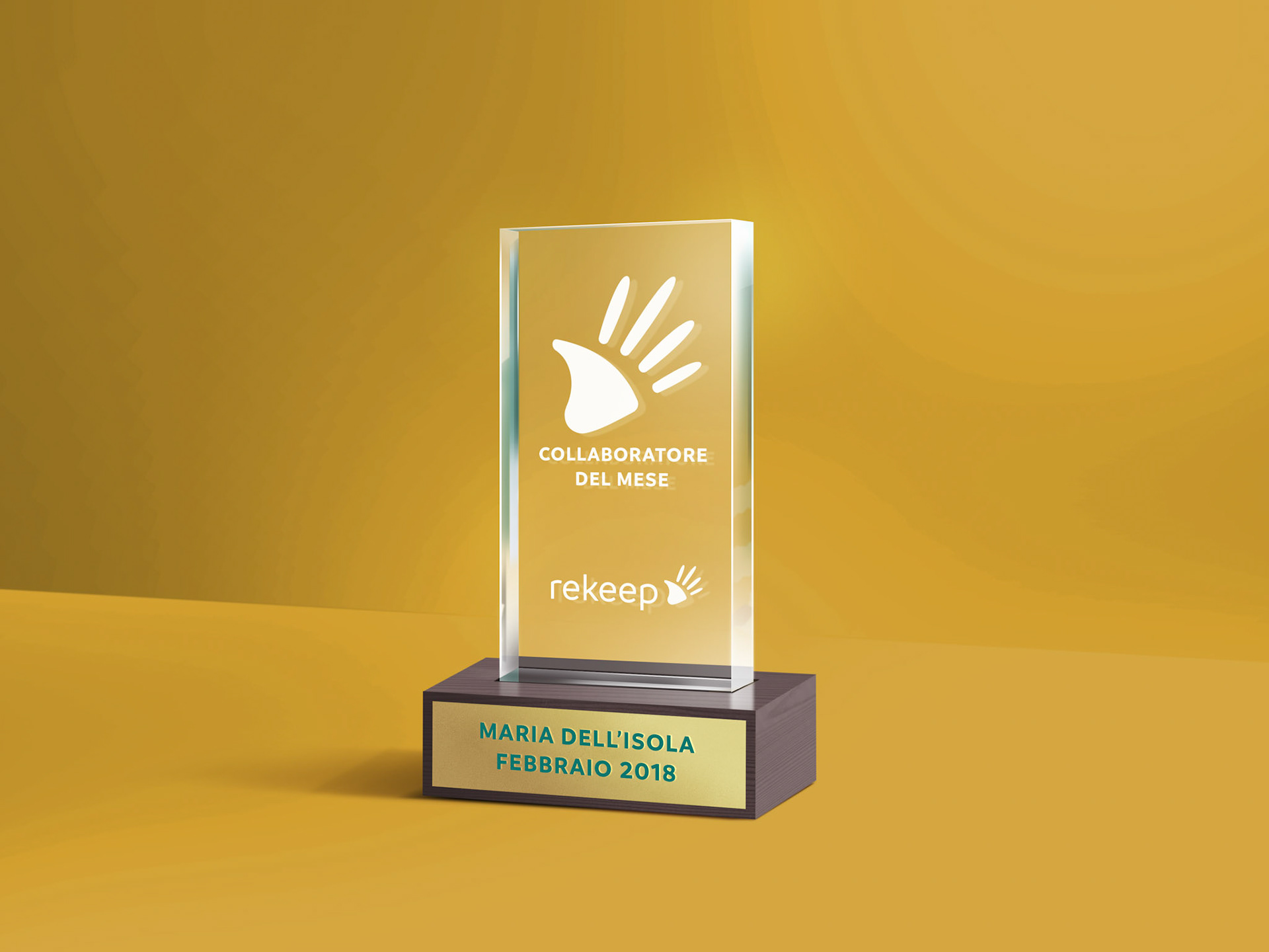
The symbol that accompanies the logotype, represents an open hand where the fingers evoke the rays of the sun. An immediate symbol, which aims to project a story of eighty years into the future, made of hands that work and take care of people and their environment.
A new name and a new identity to enrich and innovate its skills, and to widen the geographical boundaries of its market. A new challenge to translate a story into an idea of the future.
The new name is represented with a contemporary typographic character, simple and with letters composed in lower case, to underline the friendly and direct tone. The colours turquoise and yellow were chosen to underline the idea of cleanliness and efficiency.
The symbol that accompanies the logotype, represents an open hand where the fingers evoke the rays of the sun. An immediate symbol, which aims to project a story of eighty years into the future, made of hands that work and take care of people and their environment.


Client:
Rekeep SpA
Sector:
B2B / Maintenance and Facility Management
Country and Date:
Italy, 2018
Team:
Client Director: Tiziana Brandia
Creative Director: Chris Scherer
Art Director: Giulia Ferrini
Signage Consultant: Giuseppe Guerrera
Strategist: Elisa Russo
Strategist and Copywriter: Enzo de Somma
Video Animation: Romano Marini Dettina
Advertising (Art): Cristina Clausi Schettini
Advertising (Copy): Roberta Perone
Agency:
Inarea Identity Design, Rome
Design Disciplines:
• Brand & Identity Design
• Brand Architecture
• Brand Communication
• Brand Personality Building
• Brand Management
• Editorial Design
• Signage & Wayfinding Design
• Web & Digital Design
• Brand Design Manual
• Brand Design Manual