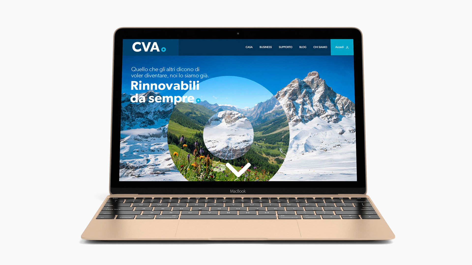
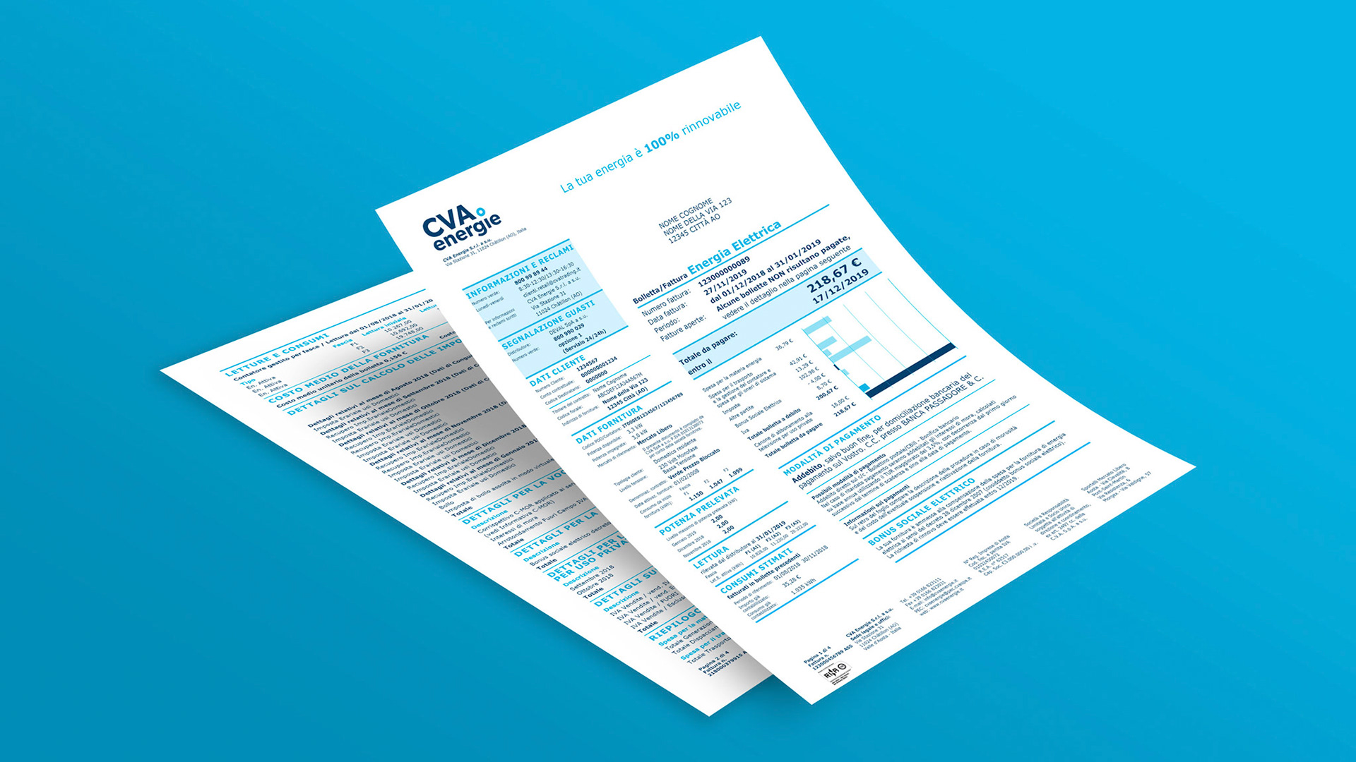
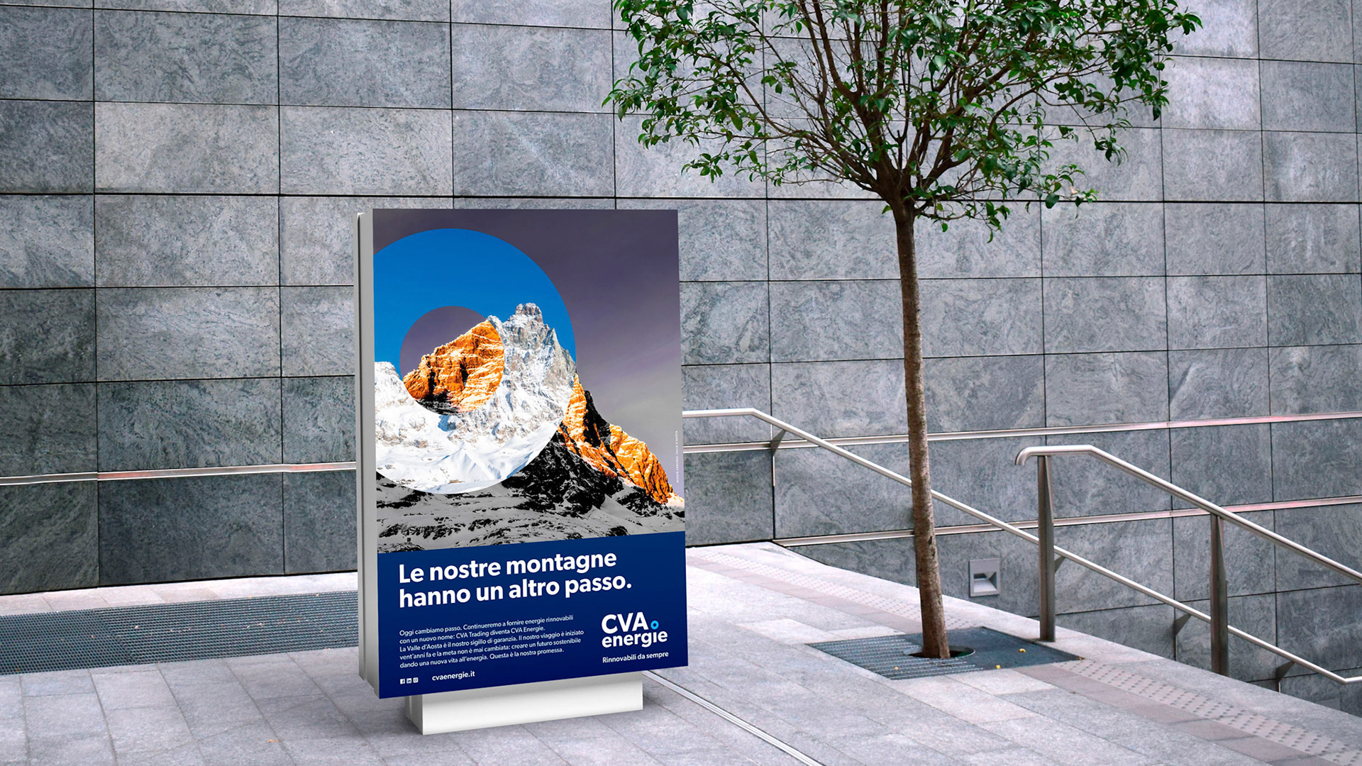
CVA Trading, a CVA Group company operating in the sale of electricity to end customers, evolved its name and brand to more clearly express its mission: transforming the Aosta Valley’s natural energy sources – water, sun, and wind – into a sustainable future.
The rebrand emerged from a broader process of strategic repositioning, rooted in the Group’s origins. Compagnia Valdostana delle Acque was founded to manage the Aosta Valley’s hydroelectric assets, and this legacy continues to inform its forward-looking vision.
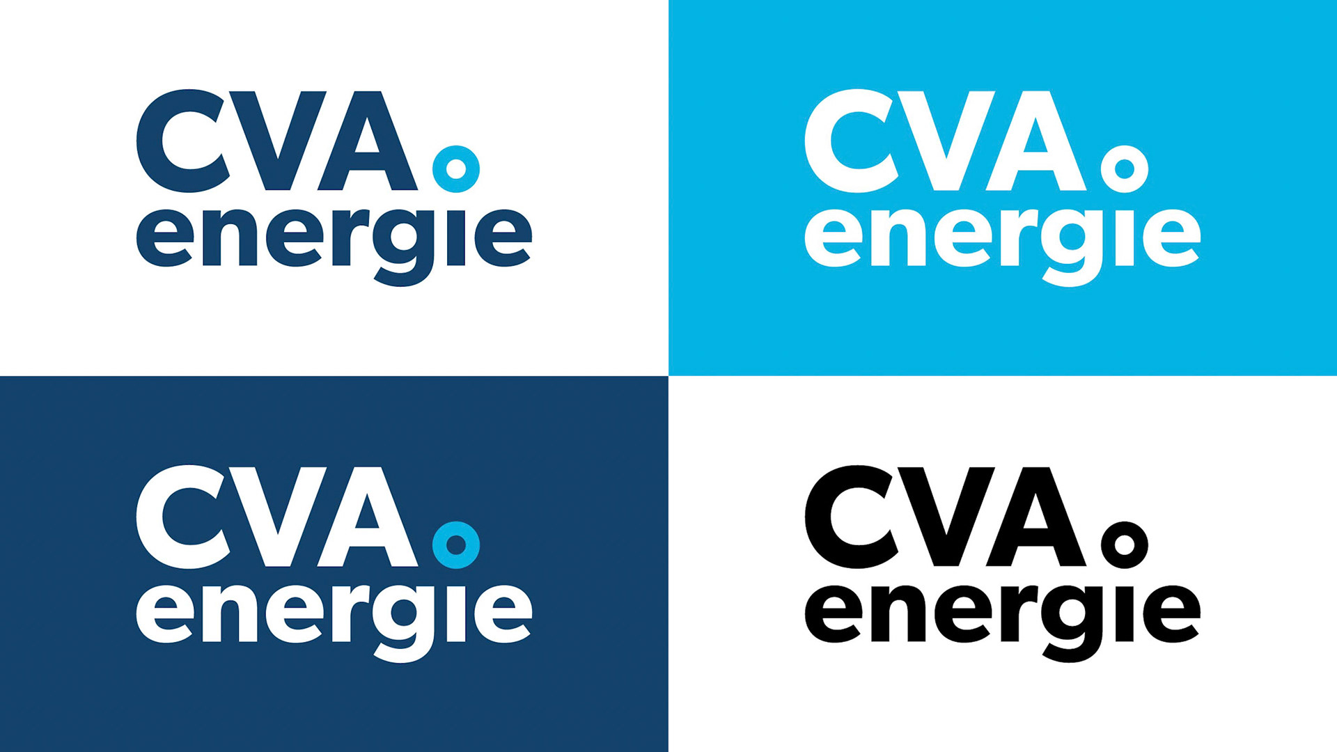
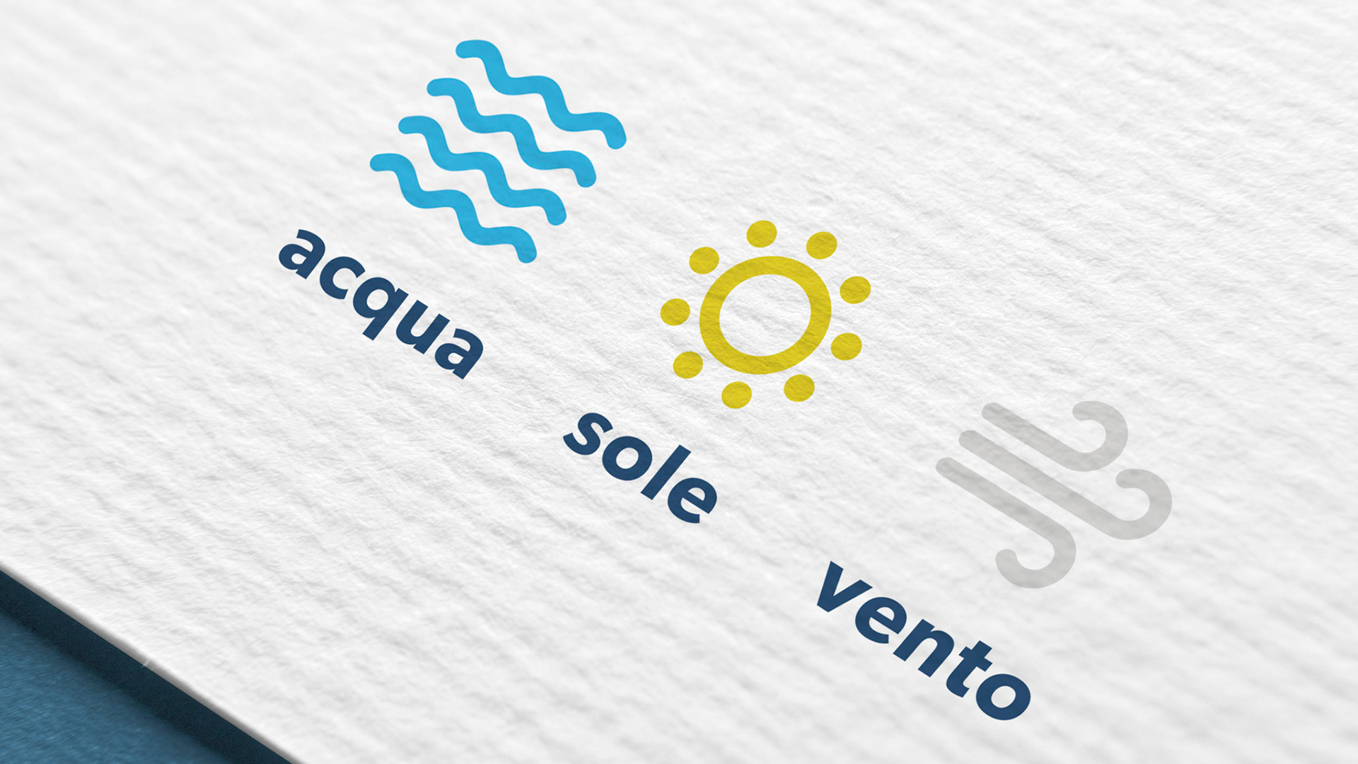
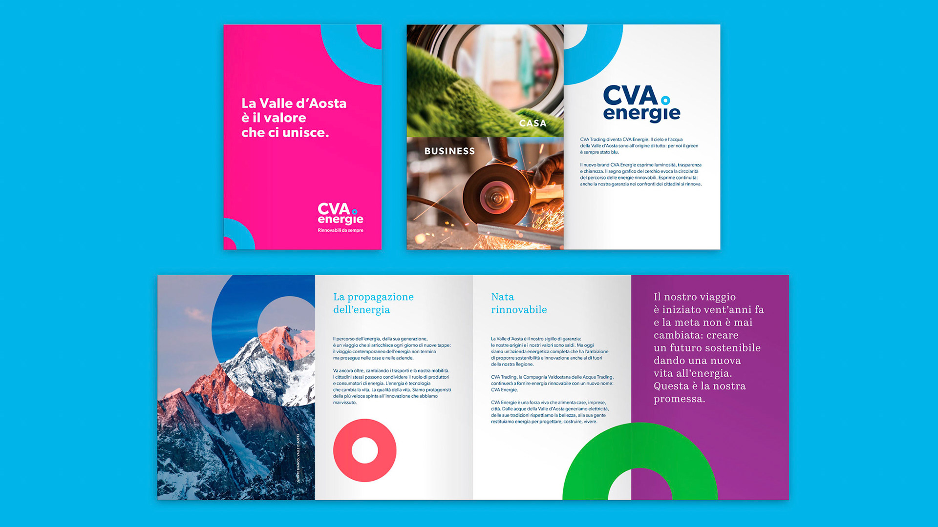
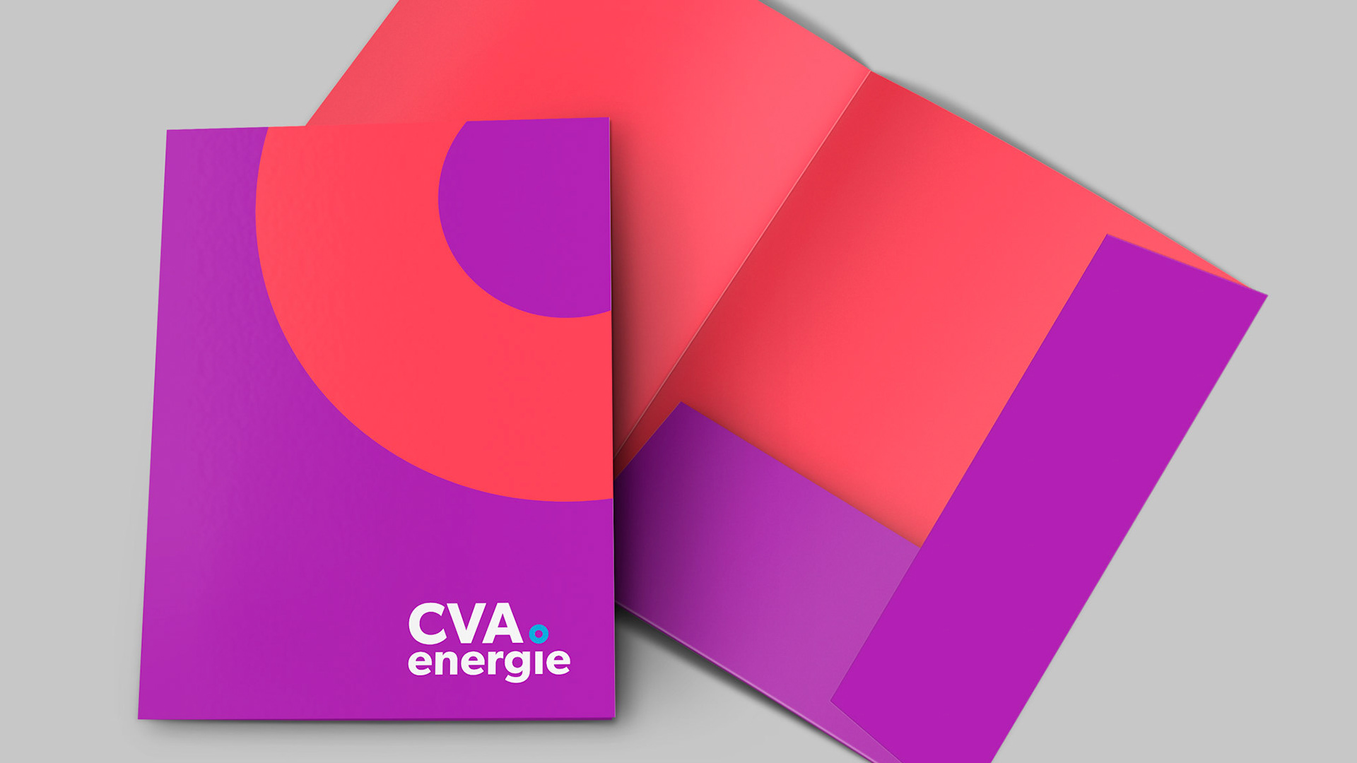
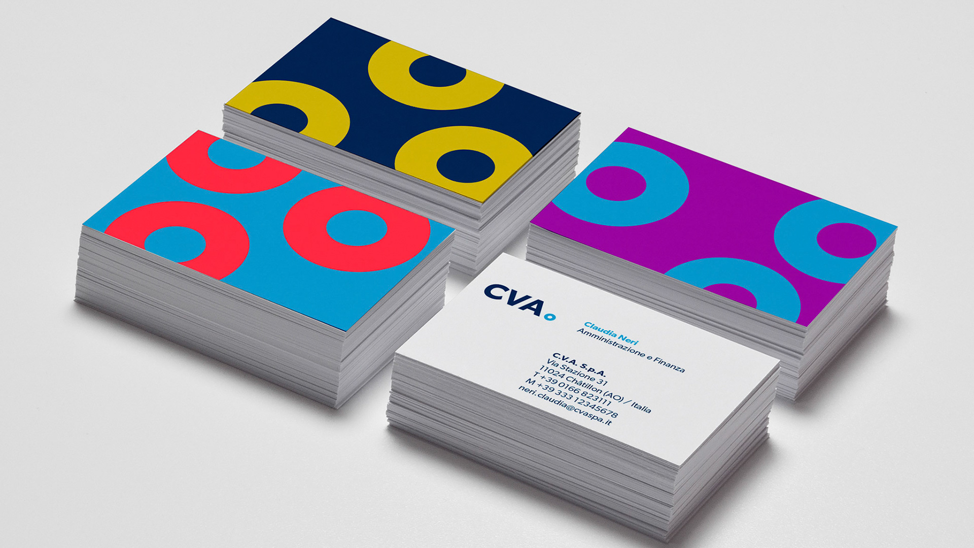
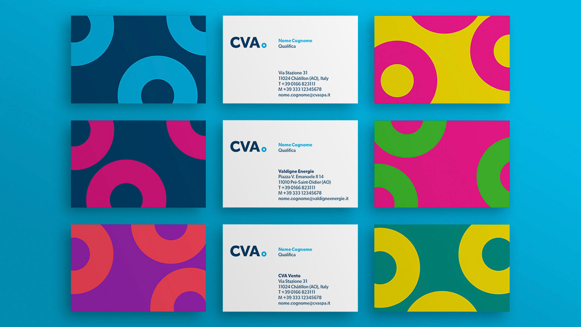
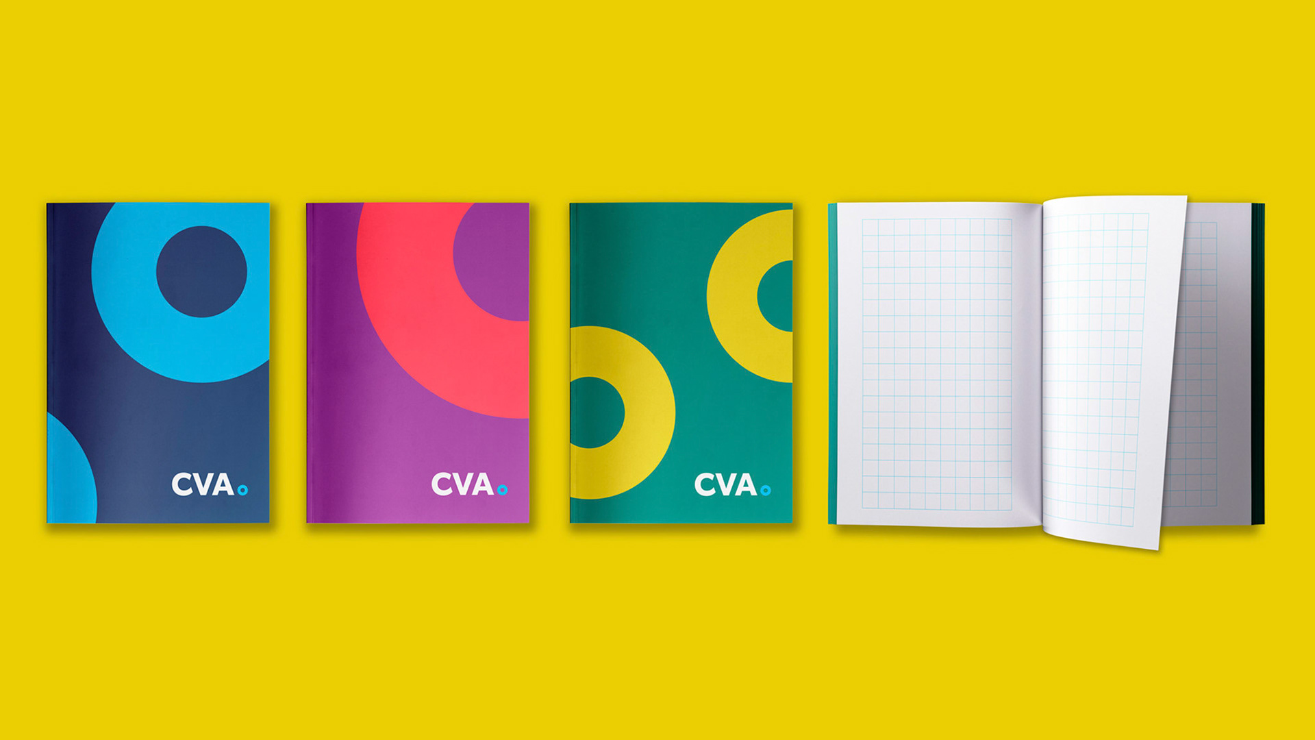
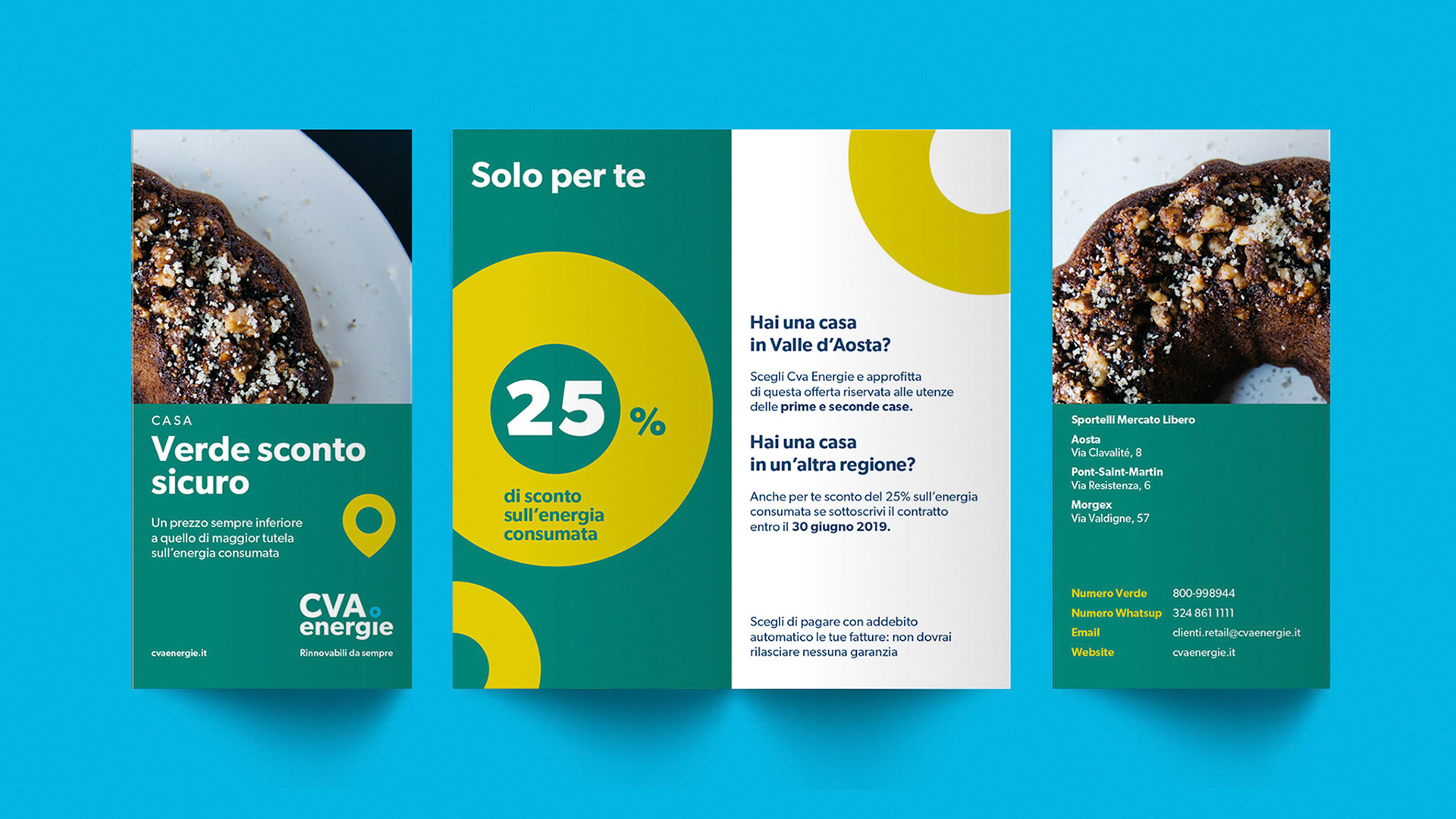
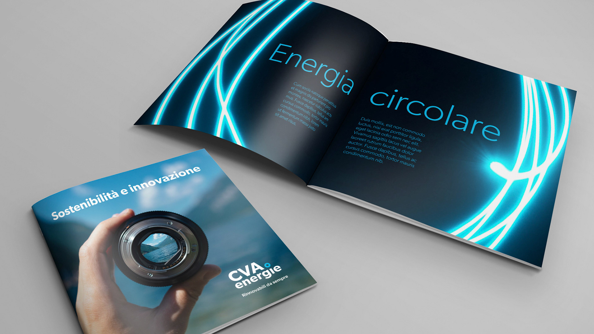
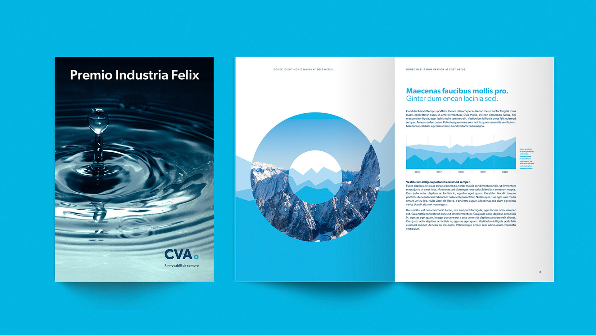
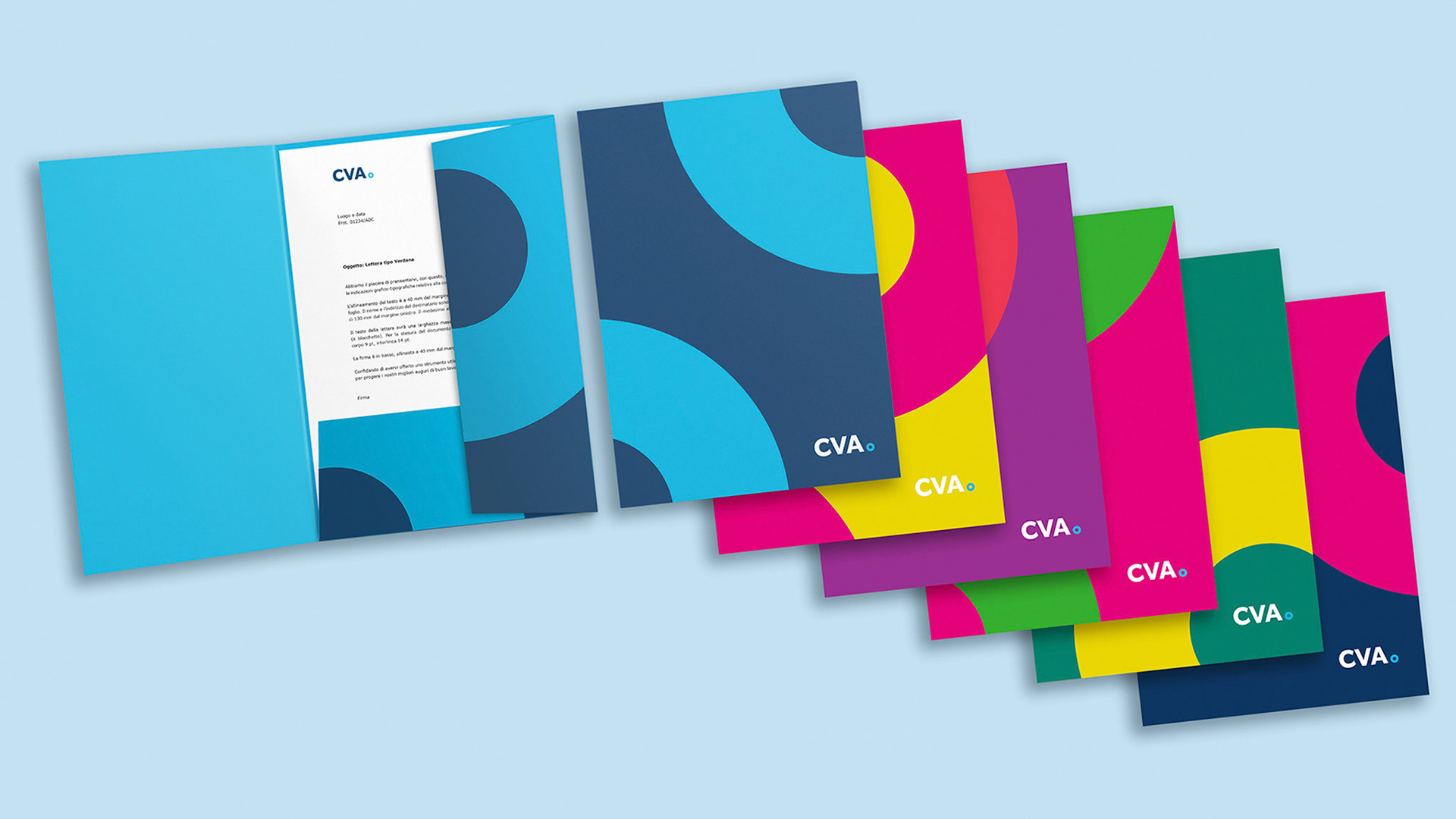
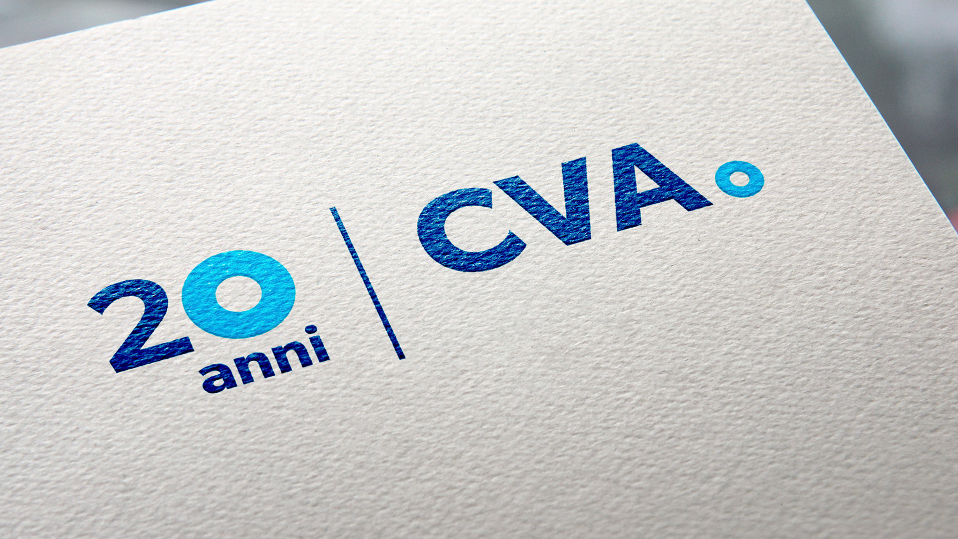
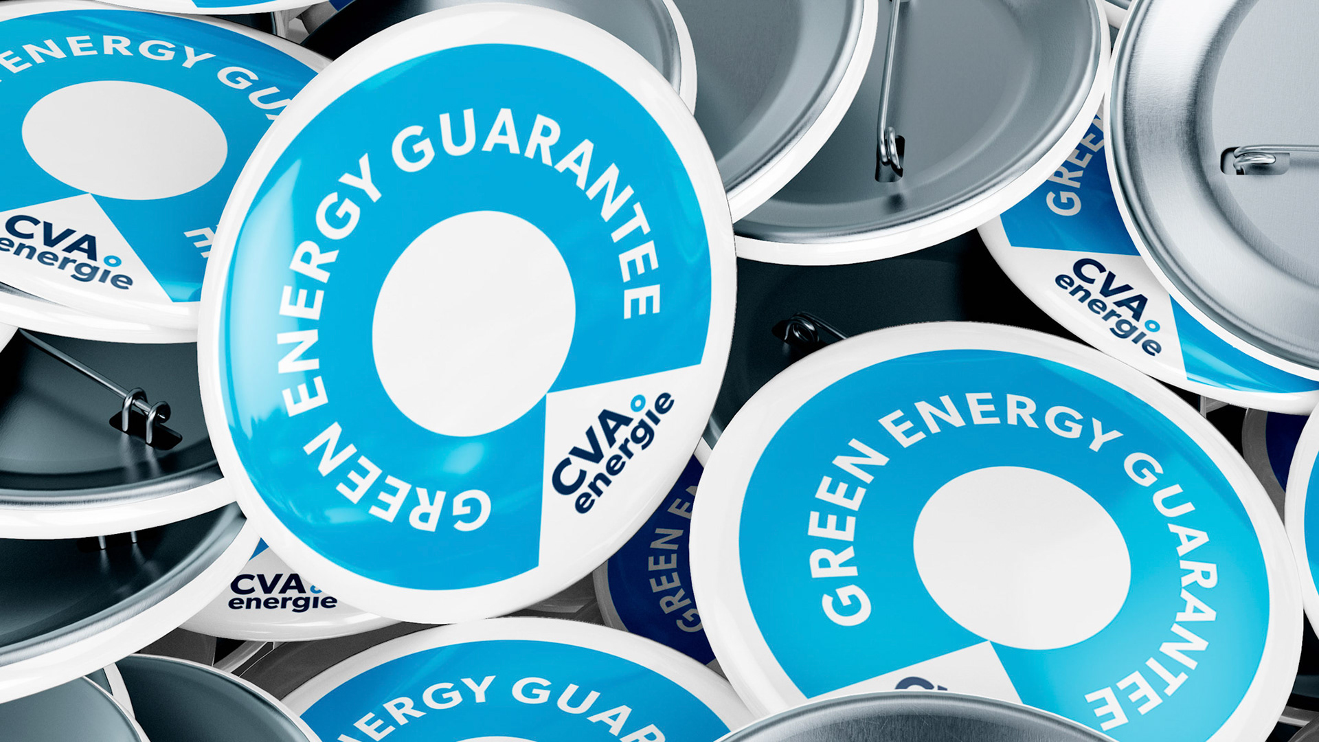
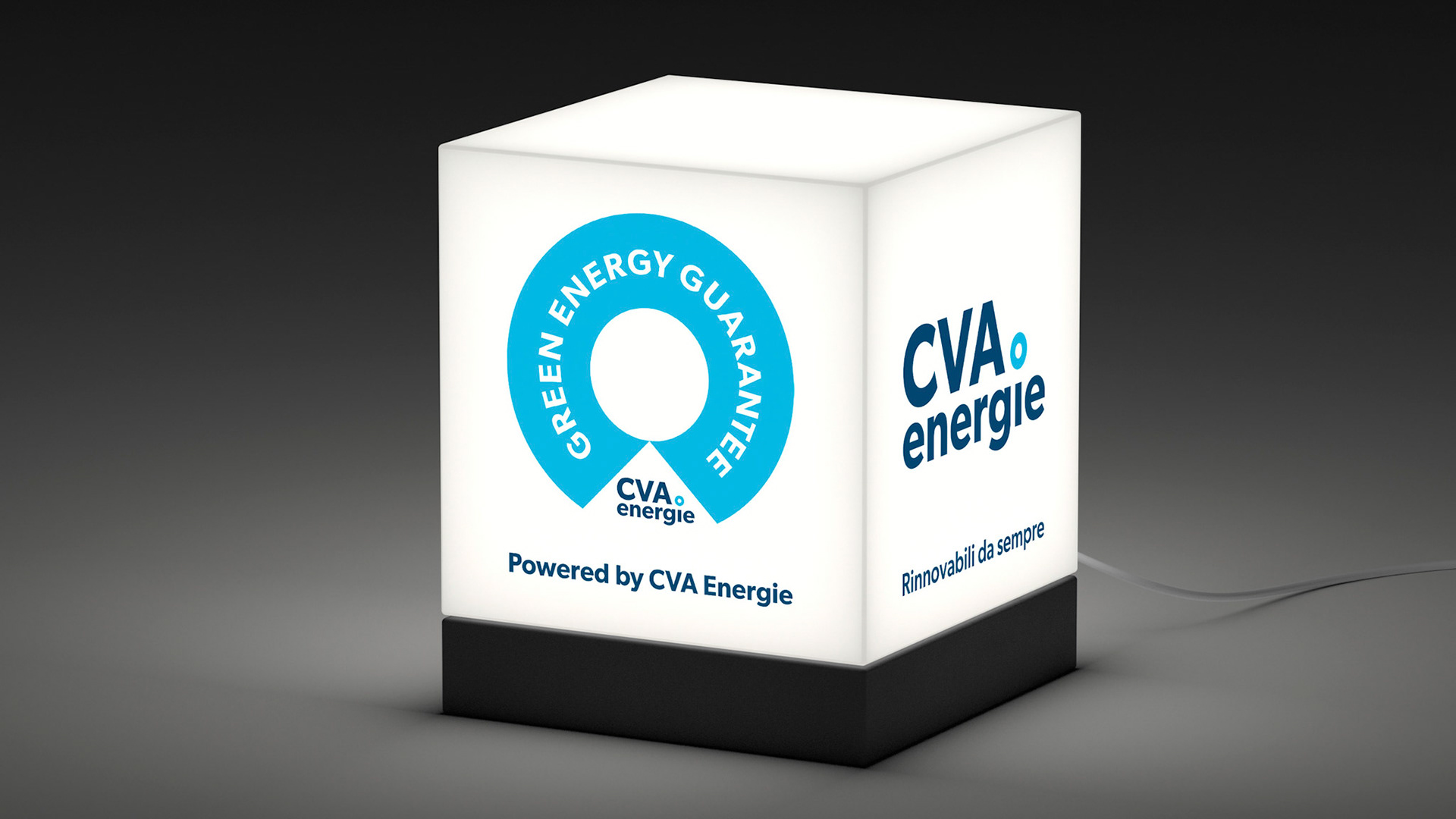
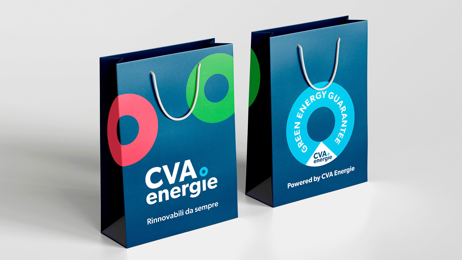
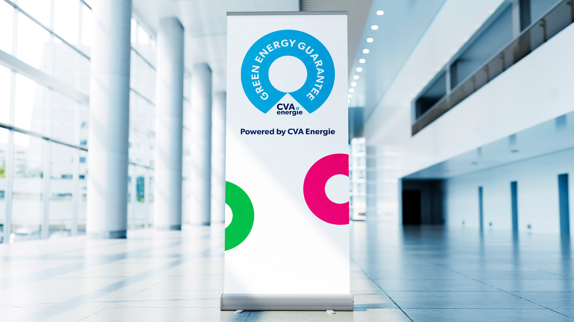
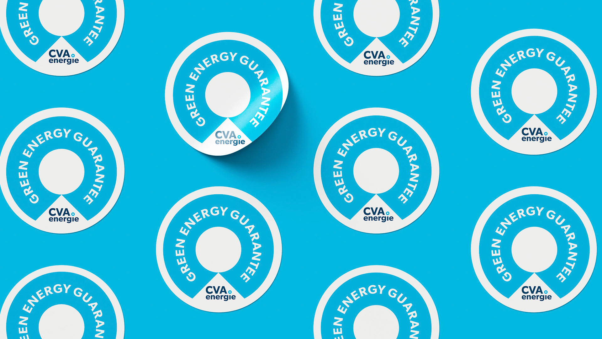
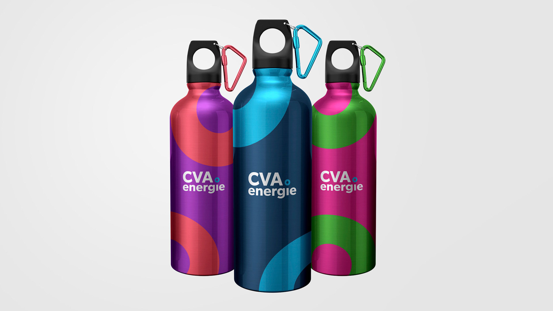
For CVA Energie, green has always been blue. Blue and light blue echo the colours of the Aosta Valley’s water, sky, and air, the natural elements that have powered the energy delivered to customers for over twenty years. These core tones are complemented by a vibrant secondary palette of lively, luminous shades, expressing the many nuances of energy as a vital force.
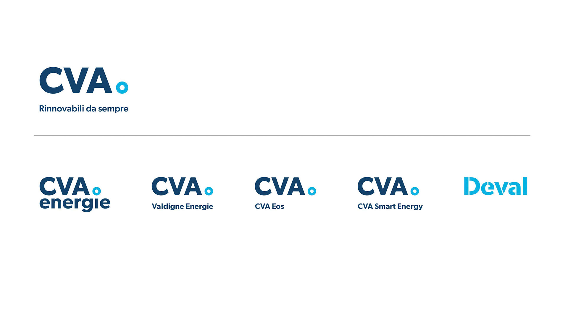
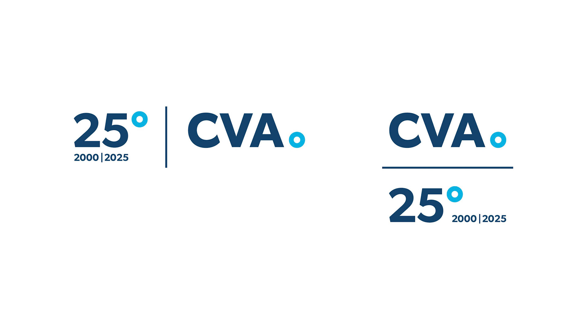
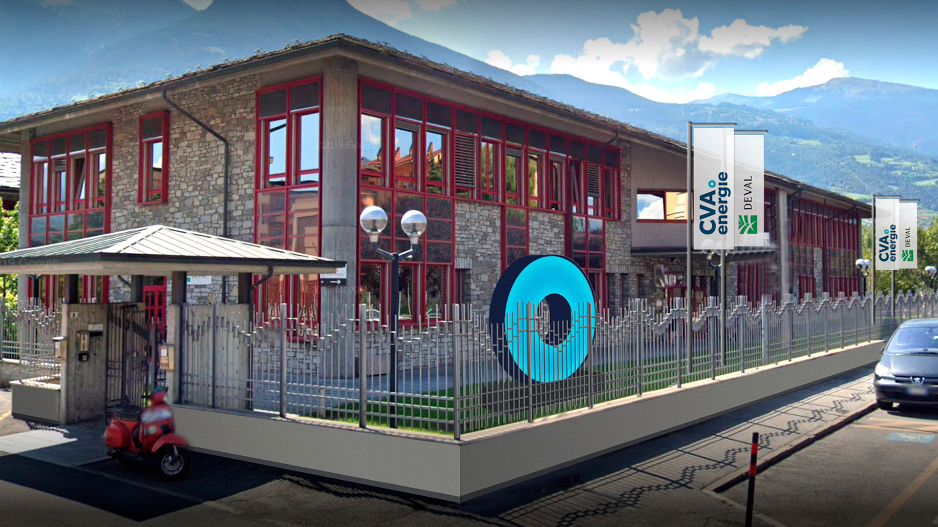
The new identity for CVA Energie also prompted a redefinition of the Group’s brand architecture, introducing a monolithic model that highlights a shared vision while preserving the distinct corporate names of its subsidiaries.
The rebrand emerged from a broader process of strategic repositioning, rooted in the Group’s origins. Compagnia Valdostana delle Acque was founded to manage the Aosta Valley’s hydroelectric assets, and this legacy continues to inform its forward-looking vision.
For CVA Energie, green has always been blue. Blue and light blue echo the colours of the Aosta Valley’s water, sky, and air, the natural elements that have powered the energy delivered to customers for over twenty years. These core tones are complemented by a vibrant secondary palette of lively, luminous shades, expressing the many nuances of energy as a vital force.
The new identity for CVA Energie also prompted a redefinition of the Group’s brand architecture, introducing a monolithic model that highlights a shared vision while preserving the distinct corporate names of its subsidiaries.


Client:
CVA SpA (Compagnia Valdostana delle Acque)
Sector:
Energy & Utilities
Country and Date:
Italy, 2020
Team:
Client Director: Elisabetta Baldini
Project Director: Tiziana Brandia
Design Director: Chris Scherer
Art Director: Sara Callini
Agency:
Inarea Identity Design, Rome
Design Disciplines:
• Brand & Identity Design
• Brand Architecture
• Brand Communication
• Brand Personality Building
• Brand Management
• Editorial Design
• Retail & Packaging Design
• Signage & Wayfinding Design
• Social Media Design
• Web & Digital Design
• Brand Design Manual