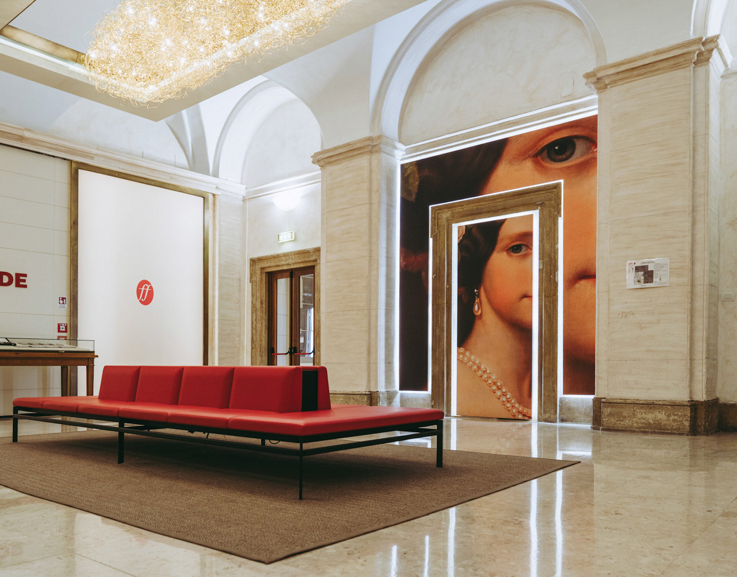
The pilot project Mumex – Poli Museali di Eccellenza nel Mezzogiorno – initiated by the Italian Ministry of Heritage and Culture and the Department for Economic Development – aims to enhance the museum offers of a selected group of Museums and Archaeological Sites in the South of Italy.
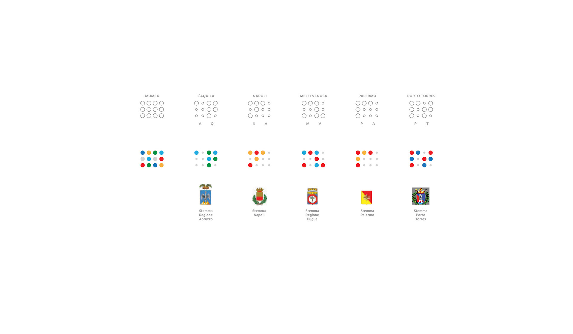
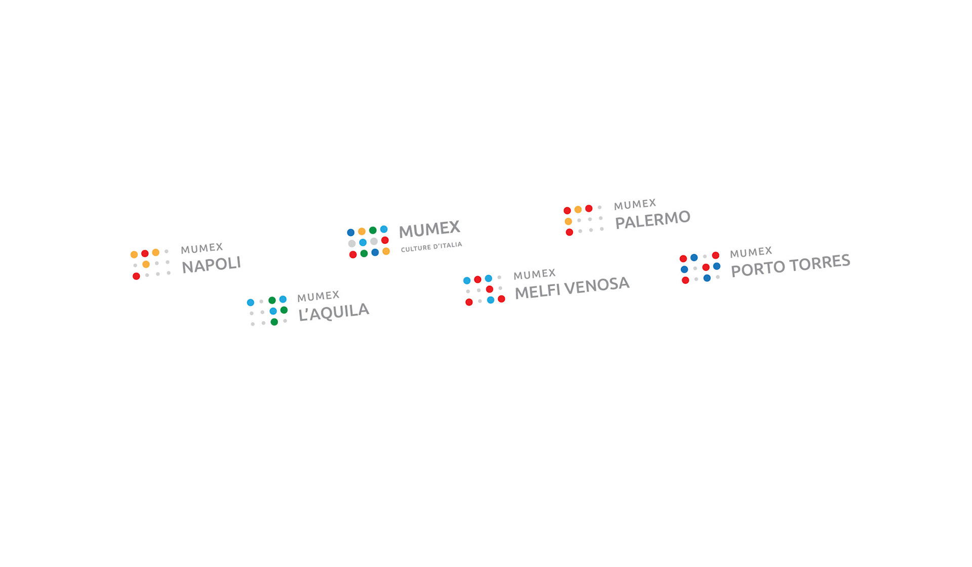
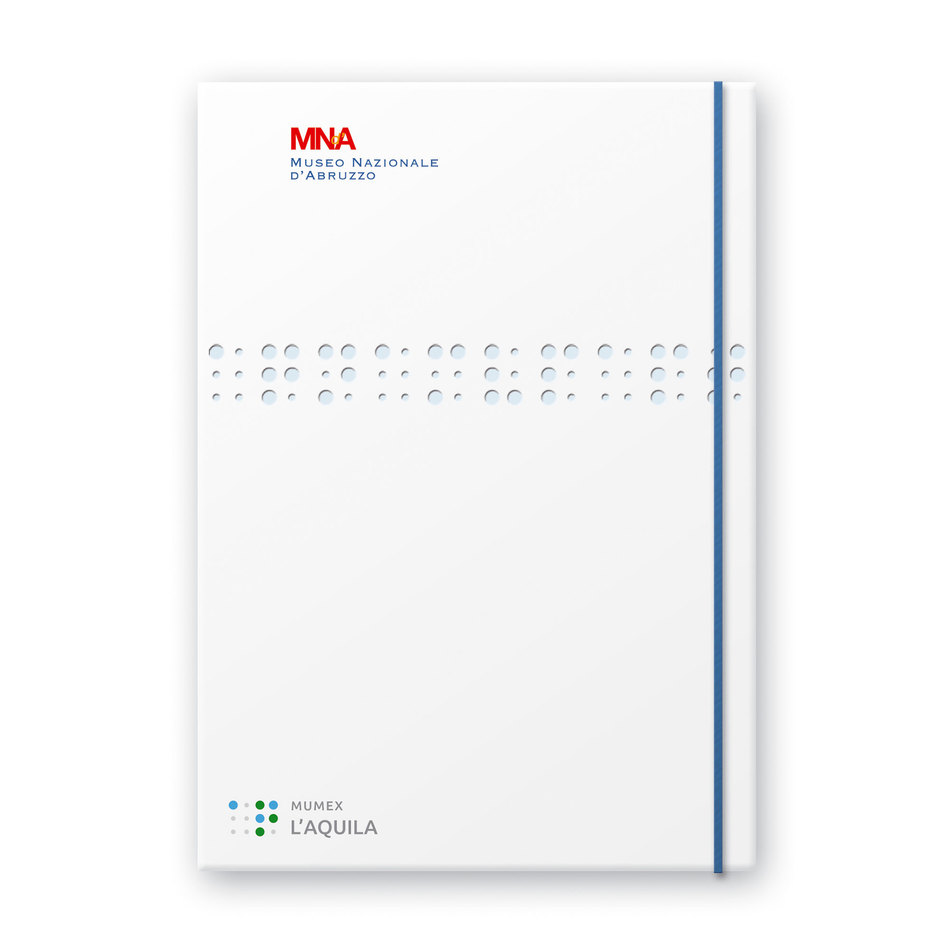
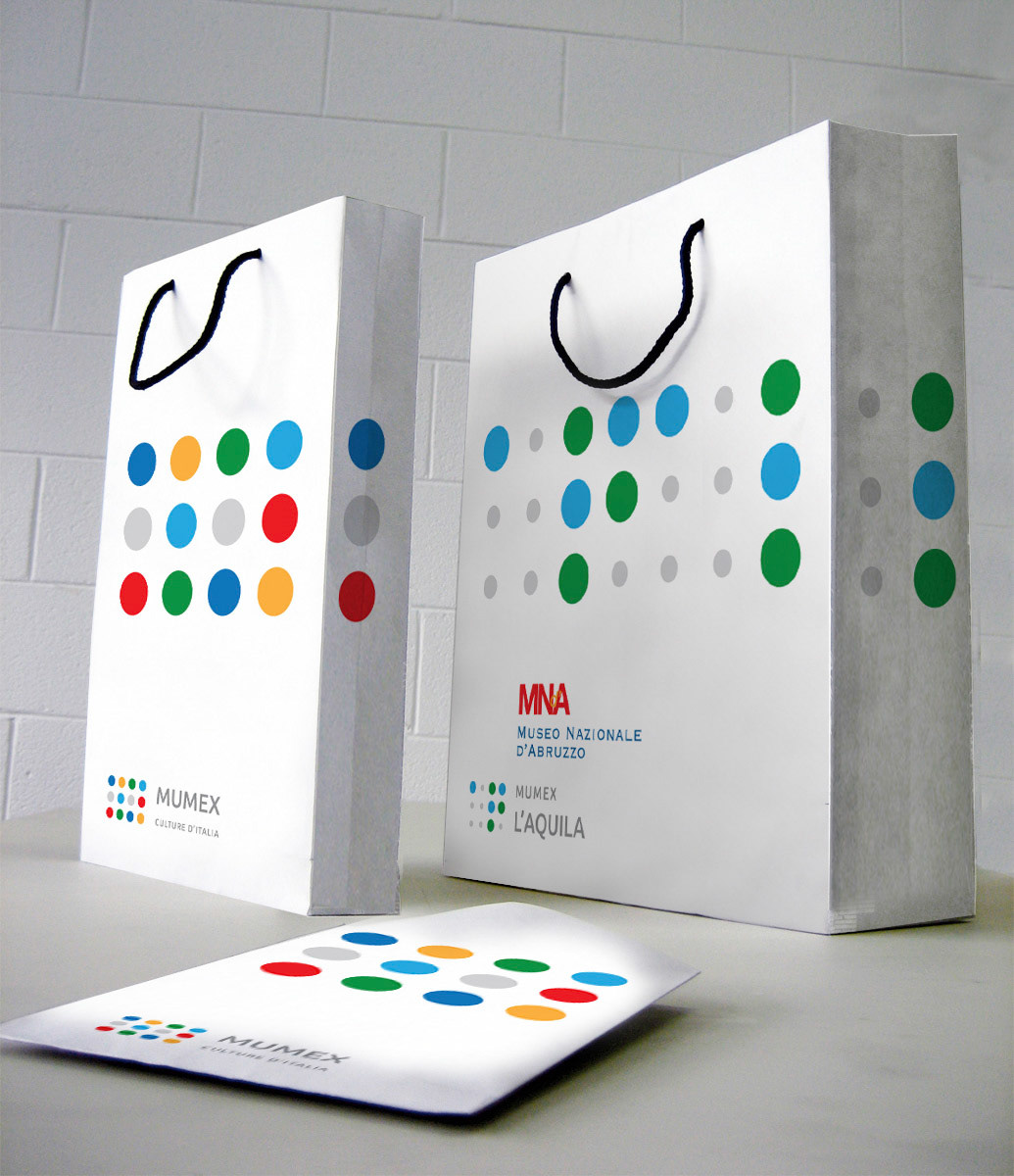
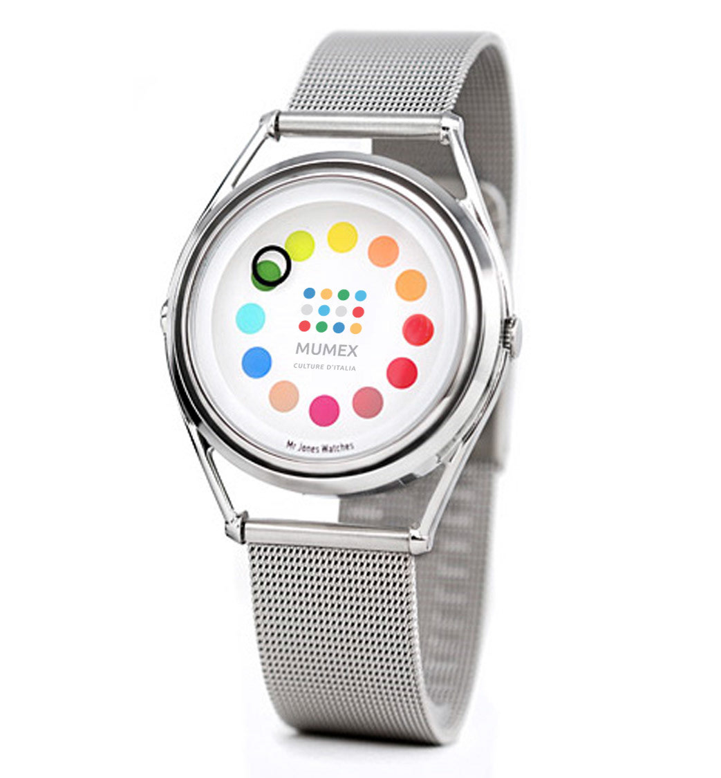
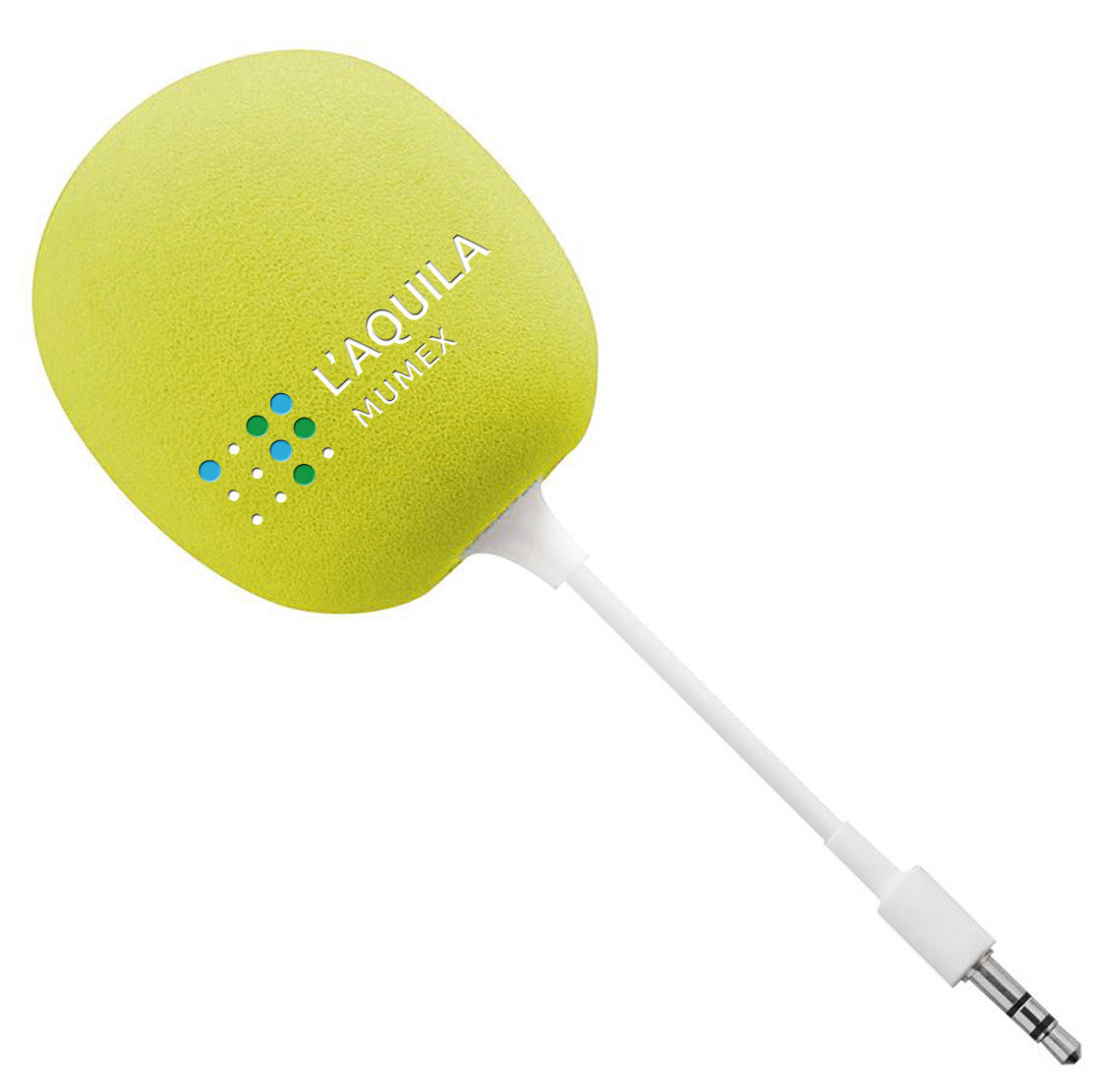
To create the symbols for the various museums, the commonly used double letter abbreviation of the city or province (ie NA for Napoli) is set in braille. The colours derive from the coat of arms of the respective city.
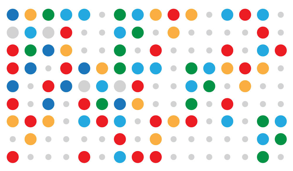
This concept was a runner-up in the final selection process of the identity.
To create the symbols for the various museums, the commonly used double letter abbreviation of the city or province (ie NA for Napoli) is set in braille. The colours derive from the coat of arms of the respective city.
This concept was a runner-up in the final selection process of the identity.

Web
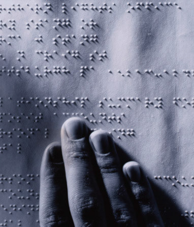
Fingers Reading Braille
Web
Web
mumex 00 pres.ai
Client:
Italian Ministry of Heritage and Culture
Department for Economic Development
Sector:
Governmental
Public Sector
Country and Date:
Italy, 2012
Team:
Project Manager: Monica Solimeno
Creative Director: Chris Scherer
Art Director: Gabriele Bonavera
Agency:
Inarea Identity Design, Rome
Design Disciplines:
• Brand & Identity Design
• Brand Architecture
• Brand Communication
• Brand Personality Building
• Editorial Design
• Retail & Packaging Design
• Signage & Wayfinding Design
• Web & Digital Design
• Brand Design Manual